Please note: If on devices you click on links to images and/or text that do not open if they should, just slightly scroll the screen to re-enable the function. Strange behavior of WordPress.
The final stages
This pages examines the most significant works of the final period (1932-1942) in view of the last completed painting which sums up the whole of Mondrian’s oeuvre.
The tendency observed in the previous page toward a space of ever-greater rarefaction and synthesis:
gradually gives way to the opposite tendency, whereby an increasing level of articulation and complexity was progressively reintroduced into the Neoplastic canvases as from 1934:
Observation of the above four works in sequential order reveals a gradual increase in the number of lines, which divide the space of the canvas into a growing number of parts.
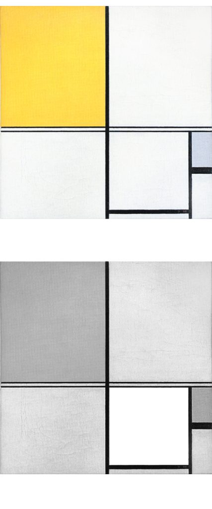
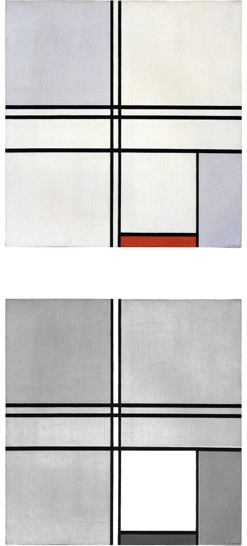
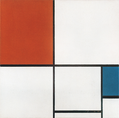
Composition B with Double Line, Yellow and Gray
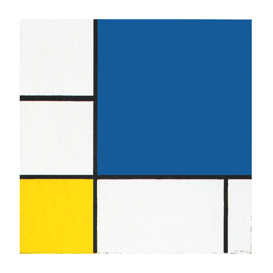
This is the first Neoplastic composition with two horizontal lines running very close to one another in place of the single horizontal to be seen in all the previous works. The thickness of the two horizontal lines is half that of the vertical:
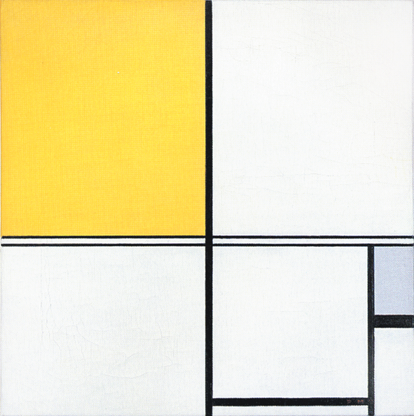
Composition B with Double Line, Yellow and Gray, 1932, Oil on Canvas, cm. 50 x 50
It is almost as though the two thin black horizontals served to mark out a white line opposing the black no longer solely at the level of form (horizontal vs. vertical) but also in terms of color (white vs. black). Black seems ready to open up to white. The small plane on the right is gray, which is an intermediate value between black and white. The yellow plane on the left counterbalances the gray. In 1933 the lines would become yellow, i.e., an intermediate shade between the lightest (white) and the darkest ones (black).
Like other compositions based on Layout C , Fig. 1 presents an area of square form closed on four sides in the lower right section. The square field expresses a moment of equilibrium between the opposing directions, which elsewhere give birth to variable proportions and then expand in a univocal and absolute way, that is, in exclusively horizontal or vertical terms, therefore suggesting a virtual infinite space which cancels out the synthesis of the opposite directions that is achieved by the square proportion.
The large yellow field in the upper left section and the gray one lower down to the right contribute to keep the square in a state of unstable equilibrium.
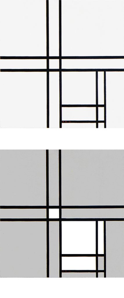
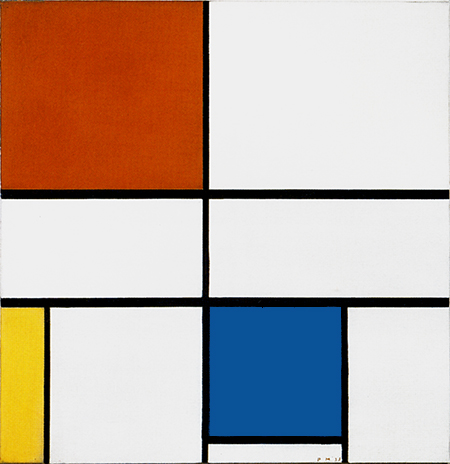
Composition in Black and White with Double Lines
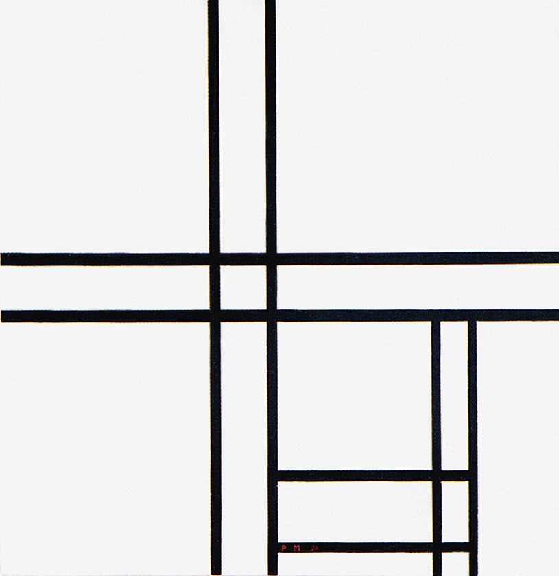
Composition in Black and White with Double Lines, 1934, Oil on Canvas, cm. 59,4 x 60,6
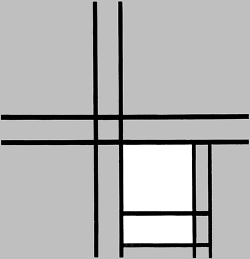
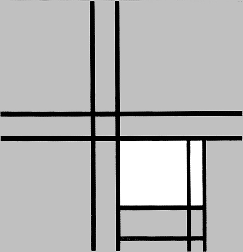
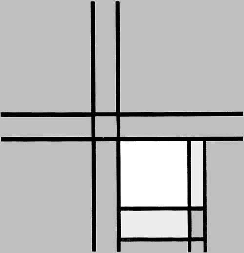
The place of the closed square form seen in Fig.1 is taken in Fig. 2 by a more complex structure made up of two juxtaposed rectangles Diagrams A and B) that interact to generate a square form (Diagram C).
This is a pattern already seen in a composition of 1925:
As in 1925, in Fig. 2 the square evoking unity emerges from the interplay between two opposite rectangles.
Vertical and horizontal lines interact to generate a small square in the center (Diagram D):
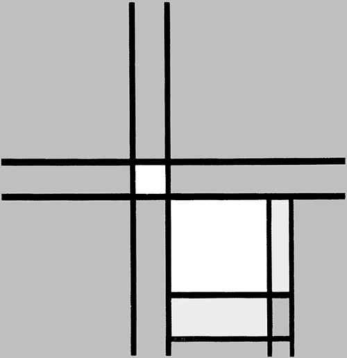
Diagram D
A relationship is established between a small square of sharply defined and definite size appearing in the center and a larger indefinite square placed in the lower section, which could almost be seen as the smaller one an instant after the lines have passed. The dynamism of the lines drags along the small central square, which opens up while remaining in unstable equilibrium between vertical (Fig. 2 Diagram A) and horizontal (Fig. 2 Diagram B) predominance. Different parts of a Neoplastic composition are to be seen as successive moments of one and the same space undergoing transformation.
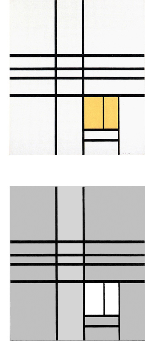
Composition with Yellow
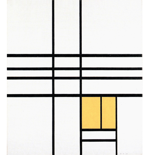
The two horizontal lines running through the central area of Fig. 2 become four in Fig. 3 which is again based on Layout C. In this case, however, the field inside the square form is no longer white but yellow and presents a vertical segment echoed by an external horizontal segment in the lower section:
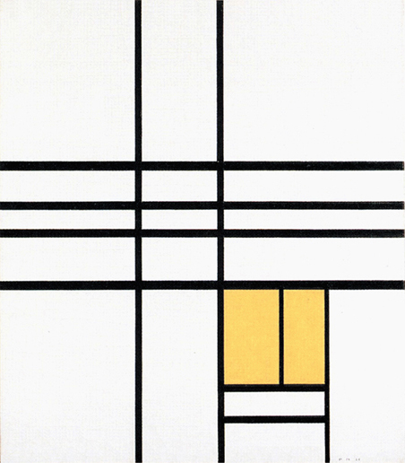
Composition with Yellow, 1936,
Oil on Canvas, cm. 66 x 74
The square form appears in a state of unstable equilibrium between an internal vertical segment and an external horizontal one. It is worth recalling that Mondrian identifies the vertical with the spiritual whereas the horizontal is a plastic symbol of the natural.
This is the first canvas based on Layout C in which the white field of the square accommodates a linear segment. This seems designed to indicate the beginning of a process of interpenetration between square and lines, that is to say, among the plastic symbols respectively of a search for stable balance between opposing drives (the square) and openness to the unpredictable evolution of existence (expressed by the dynamism of the lines) that upsets the balances achieved.
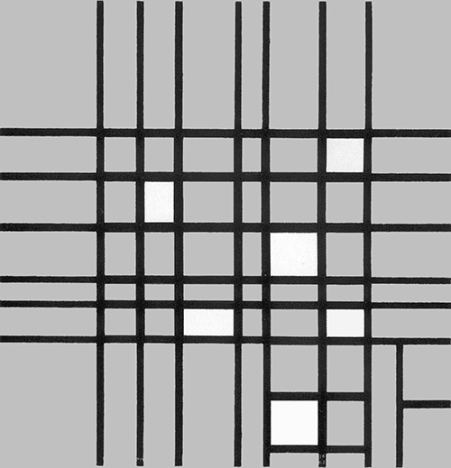
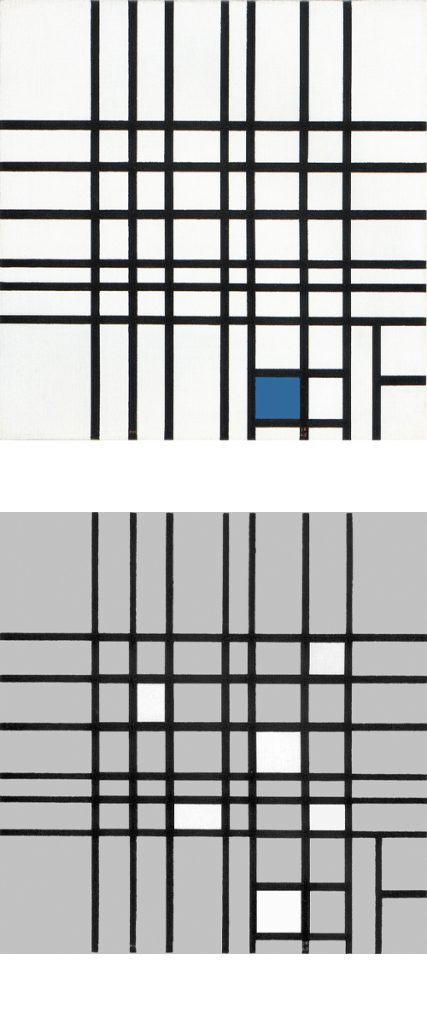
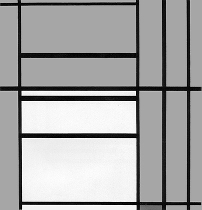
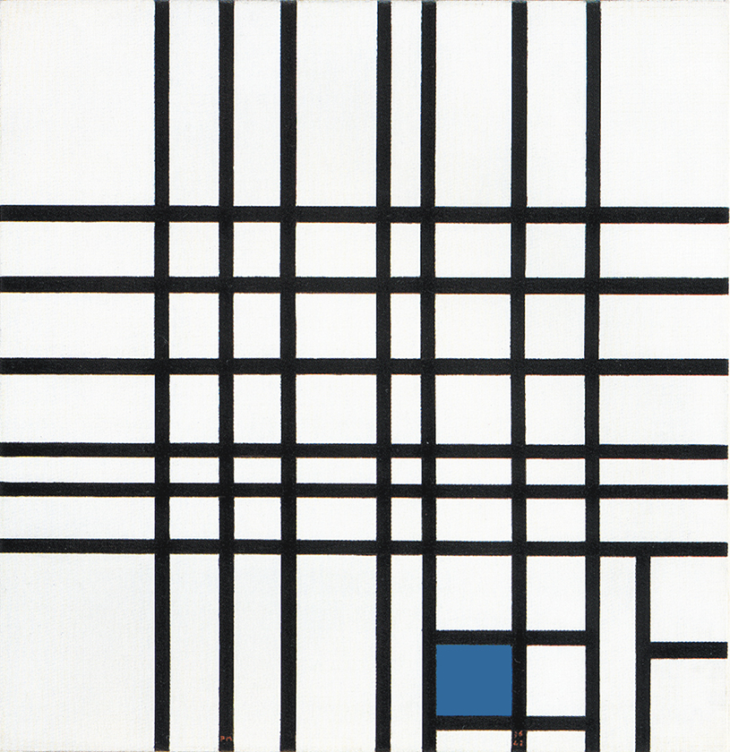
Composition N. 12 with Blue
We are confronted here with seven vertical and six horizontal lines whose interaction generate white planes of various shapes and sizes. Areas of greater or lesser horizontal and vertical extension can be seen. Vertical and horizontal attain equivalence in some points for an instant to form smaller or larger squares (Fig. 4 Diagram A):
Space expands and contracts under the pressure of the two contending directions, which attain a more stable equilibrium for an instant before opening up again to the more or less marked predominance of one or the other direction. Equivalences of opposite values are born and dissolve, are lost and found again in forms that are always new.
The idea of the square seems to be expressed here more as a process than a state. The solid and definite square of the 1920s now appears to undergo dilution on contact with the lines. The latter interact to expand and contract the space, above all in the central area, outside which they become entities in their own right; all horizontals or all verticals, one thing excluding the other and therefore eliminating any possible attempt to establish unity between the opposites.
In the lower right section, the central field flows toward an area of greater synthesis where we can pause to observe a smaller number of planes (Fig. 4 Diagram B):
One of a bright blue color appears as the fourth part of a larger form that recalls the square of the Layout C by virtue of the position it occupies.
We move from an area of extremely variable space (the central field), where equivalence appears in a state of becoming, to one in which the space is more constant (the smaller field in the lower part) and then to a more stable synthesis of opposite values high-lighted by color. The accent of color seems designed to draw attention to a square, which appears as a sort of model of which the planes observed in the central area constitute an on-going variation:
I recall the compositions of 1919 in which all measurements and proportions varied on the basis of a constant module. There is no longer any prior control in 1937:
Composition N. 12 with Blue (Fig. 4) appears to offer a summary of all the compositions that Mondrian produced between 1930 and 1935 involving variations on the theme of the square:
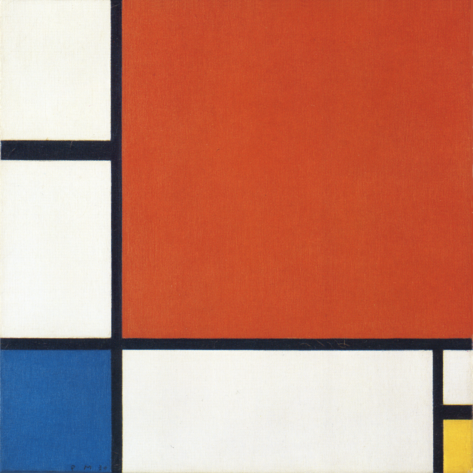
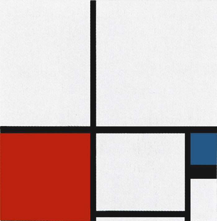
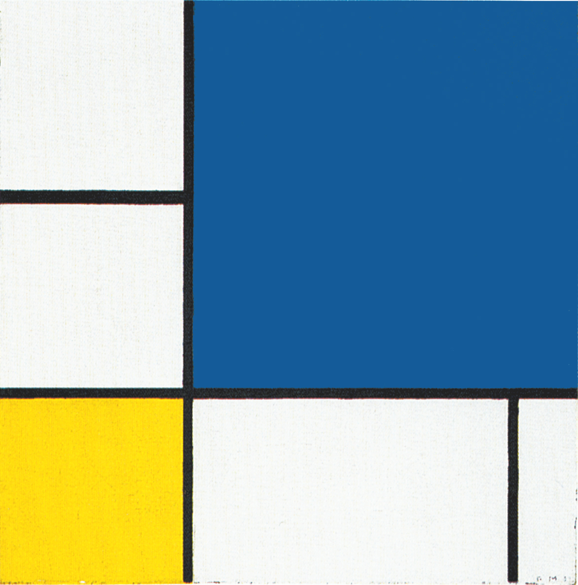
In these compositions we see white and/or colored squares along with a variety of not always fully attained attempts to reach an equivalences of opposites, i.e. a square proportion. In this regard I recall Pier and Ocean 5. We now seem to see all these variable proportions brought together in Composition 12 with Blue (1937-42).
In the course of the 1930s we move from a sharply defined square (Fig. 1) placed in a state of dynamic equilibrium between two opposite rectangles (Fig. 2) to a square module in a state of becoming that has undergone total interpenetration with the lines and is expressed as a continuing variation of itself (Fig. 4):
Observation of the three works in sequential order reveals how the “white line” running through the center of Fig. 1 leads through Fig. 2 to the multiplicity of Fig. 4.
In 1937 Mondrian published an important essay entitled “Plastic Art and Pure Plastic Art”. Interest in his work increased steadily in England, but especially in the United States, among both collectors and fellow-artists.
In January 1938 he wrote to Harry Holtzman that he had in mind the project for a modern school of aesthetics that, as an alternative to the New Bauhaus in Chicago, would promote a new teaching of art, architecture and industry.
Hoping to overcome his recurring sense of weakness and frequent respiratory infections, Mondrian adopted a vegetarian and salt-free diet.
Michel Seuphor, Piet Mondrian, Sa Vie, son Oeuvre, 1956
It appears to be a short step from Composition N. 12 with Blue to New York City:
In actual fact, however, the process of spatial multiplication was not completed so quickly. It was a laborious undertaking that took seven years of patient effort and a far larger number of works. Mondrian produced no fewer than sixty-five canvases between 1932 and 1942, some of which were reworked in New York City after 1942 while about a dozen were left unfinished. While aiming at increasing the elements forming these new compositions, the artist adopted several solutions leading ultimately to the same result which is to evoke on a bi-dimensional space the infinite multiplicity of the world considered as a unity and, at the same time, consider every single thing as an endless complexity of parts.
Mondrian: “The one seems to us to be only one, but is in actual fact also a duality. Each thing again displays the whole on a small scale. The microcosm is equal as composition to the macrocosm, according to the wise. We therefore have only to consider everything in itself, the one as a complex. Conversely, every element of a complex is to be seen as a part of a whole. Then we will always see the relationship; then we can always know the one through the other.“
During this phase we see the opening and multiplication of unity in all the works produced between 1932 and 1942, but the progress achieved was very slow. There were phases of uncertainty with works begun but never completed or taken up later and altered.
In 1936 Mondrian lived in a much less spacious studio on the second floor on the courtyard, boulevard Raspail in a plush-looking building. It was there, in this studio that he did not like, to which he did not seem to be able to get used, that the sounds of war came to haunt his mind. Fascist Italy, Hitler’s Germany, Franco’s Spain were becoming more and more threatening. France seemed to be surrounded. After Munich, Mondrian saw war imminent.
Knowing that Paris would be destroyed, an easy target for German planes, he announced his arrival to Nicholson and Gabo, and left for London, with no thought of returning, on September 21, 1938. “I’m on my way to America,” he said upon arrival. But he felt very well in London and in the studio room that Gabo and Nicholson had found for him, opposite their studios in Hampstaed, he immediately began to work.
Settled in London, in the month of October of the 1938 Mondrian arranged the shipment of the paintings of greater dimensions, the gramophone, twelve discs and one case of manuscripts. He often hosted his friends for dinner and even sold some of his paintings. With Mrs. Gabo’s help, he bought bare wood furniture from a wholesale dealer and painted it white.
Michel Seuphor, Piet Mondrian, Sa Vie, son Oeuvre, 1956
Neoplasticism evolves through new works
The evolution of Neoplasticism toward articulation and complexity continues with new compositions Mondrian works at between 1934 and 1942. These can be grouped into three basic sets.
We have just examined the first set of works which shows a multiplication and diversification of the square into a variety of slightly more horizontal or vertical proportion which are in some cases highlighted by colors:
We shall now examine a second set of works which presents a square form interpenetrating with a vertical field that runs through the whole composition from the bottom to the top. The vertical field seems to originate from the double vertical lines of the first composition shown below:
The third set of works reveals the need to maintain the visibility of a large square generated by the combination of various proportions that interact with one another to evoke moments of equilibrium inside a space that changes constantly in appearance:
The common denominator of all these new works is to interpenetrate the equivalence of opposites (the square) with the dynamic and ever-changing flow of the lines.
Let us observe some of these works.
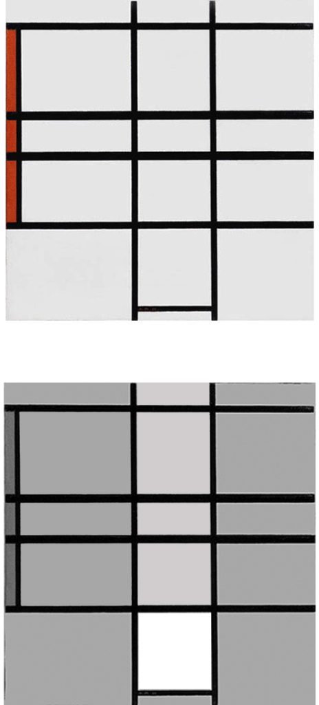
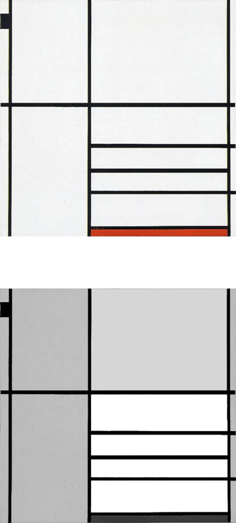
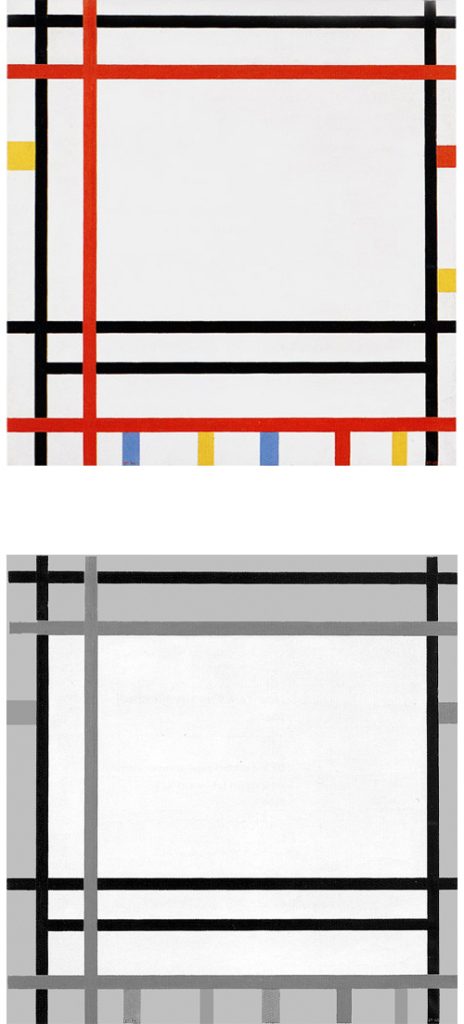
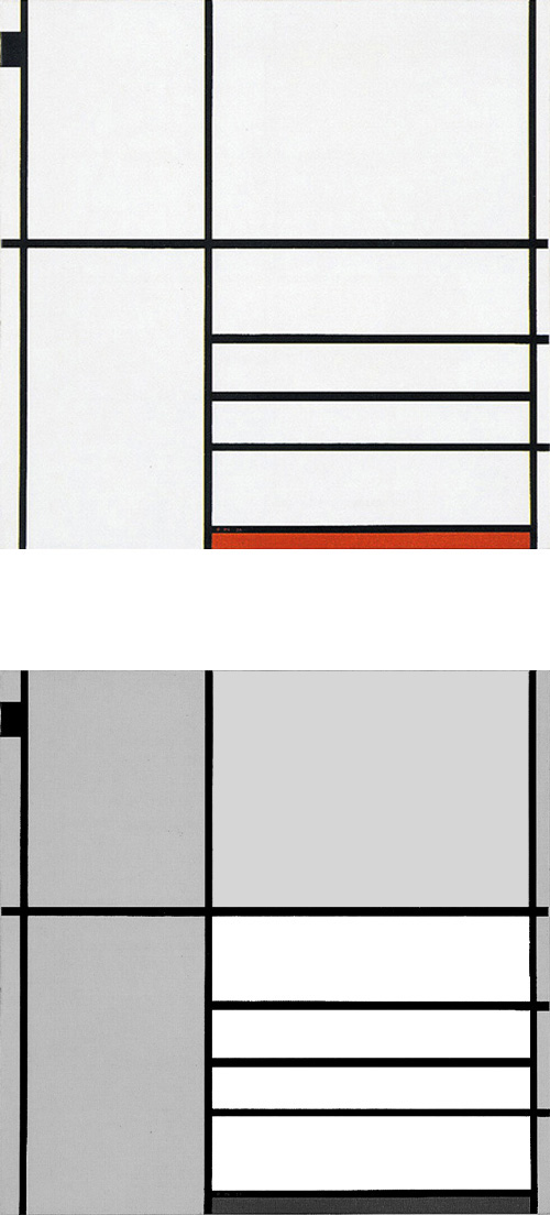
Composition Blanc et Rouge B
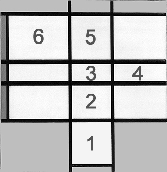
The red plane gives the vertical measure to a field generated by four horizontal lines contending for the space with the two verticals running throughout the central area of the canvas. An approximate square at the bottom moves upward along the two vertical lines and merges with the four horizontal lines:
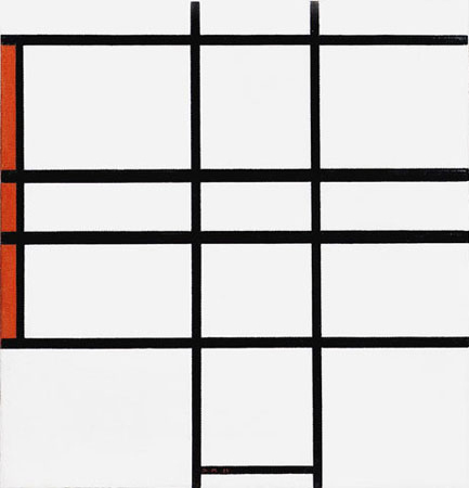
Composition Blanc et Rouge B,
1936, Oil on Canvas, cm. 50,5 x 51,5
Diagram A: Through this interaction the square (1) takes on horizontal proportions (2) that are accentuated (3 and 4) before regaining vertical development (5) and open up again to an horizontal prevalence (6).
The initial square form displays now a variety of possible relations between the opposites. Unity reveals multiplicity:
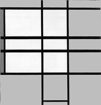
The smaller approximate square (Diagram A – Area 1) seems to turn into the larger one (Diagram B), as though the two forms were successive moments in the transition of the same entity from a state of comparative stability and certainty (the small compact square) to a dynamic condition of less stability and multiplicity (the large manifold square).
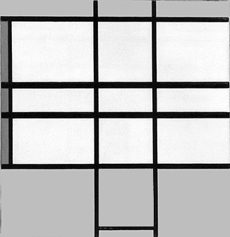
As we observe the large composite square (Diagram B) the endless straight lines run off to the right reopening the previously attained equivalence of opposites to a marked horizontal prevalence. (Diagram C):
We are confronted with a geometry of becoming.
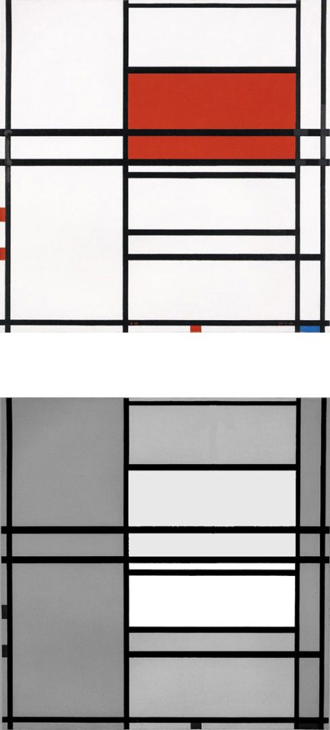
Composition in White, Black and Red
The tendency to open up, divide and dynamize the equivalence of opposites (the square form) takes shape here:
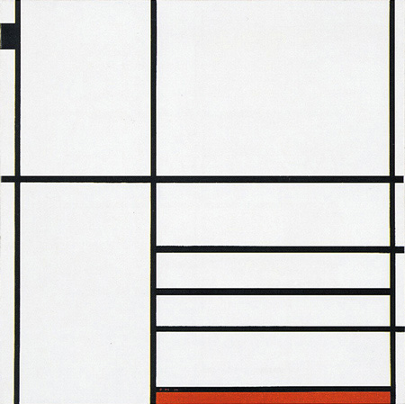
Composition in White, Black and Red, 1936,
Oil on Canvas, cm. 102 x 104
The lines work in fact to divide the space of the canvas into four main areas of different proportions. Only one of these, underscored by a red plane, is closed on four sides and approaches the proportions of a square. This square is larger than what is normally seen in the compositional Layout C.
While the homogeneous square field of Fig. 5 opens up to a vertical segment in Fig. 3, it increases in size and opens up to three horizontal segments (Fig. 7) that divide the square inner field and make it less homogeneous and stable. Among the three horizontal segments, the central one is wholly included in the square form while the other two extend outside towards the right. A black accent in the upper left section counterbalances the weight of the segments and of the red plane.
Composition N. 4 with Red and Blue
Fig. 7 was produced in 1936 and Fig. 8 in 1938, implemented with some color accents the painter added to the composition in 1942.

Composition in White, Black and Red, 1936, Oil on Canvas, cm 102 x 104
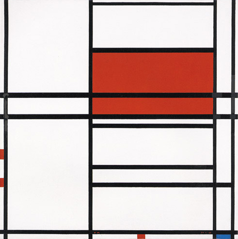
Composition N. 4 with Red and Blue, 1938-42, Oil on Canvas, cm. 99,1 x 10³
On Comparing the two works, we seem to see the square area in Fig. 7 extending upward in Fig. 8.
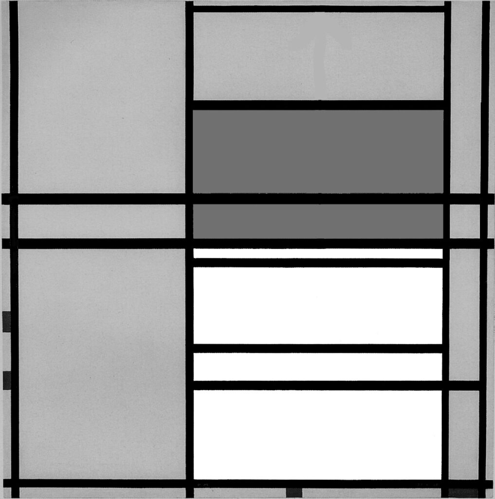
Diagram A
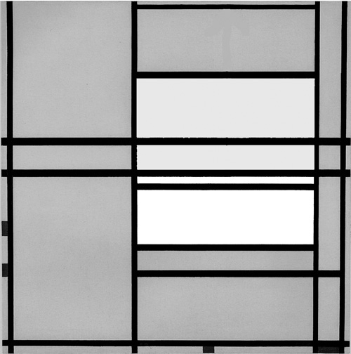
Diagram B
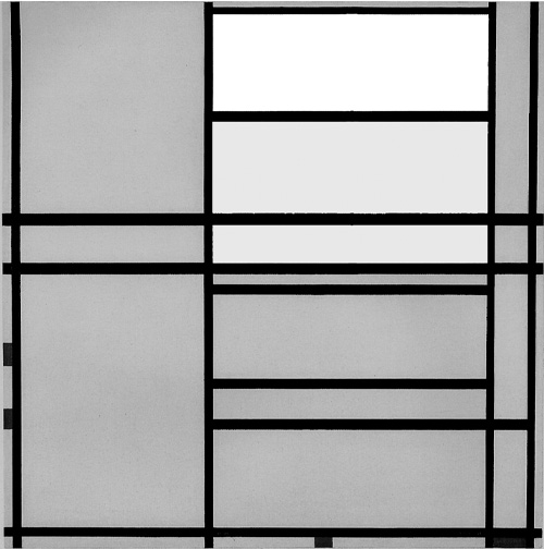
Diagram C
The large square of Fig. 7 thus becomes a dynamic vertical field in Fig. 8 marked by horizontal segments that generate a series of rectangles, one of which is red. By combining ssome of these rectangles together, we can glimpse square forms taking shape, merging with red and then dissolving towards the top.
Composition N. 1 with Red
This composition presents an analogous development to Fig. 8 with a vertical field marked out by horizontal rectangular sections.
With respect to the layout of the previous canvas, the vertical field made up of horizontal rectangles is here shifted to the left.
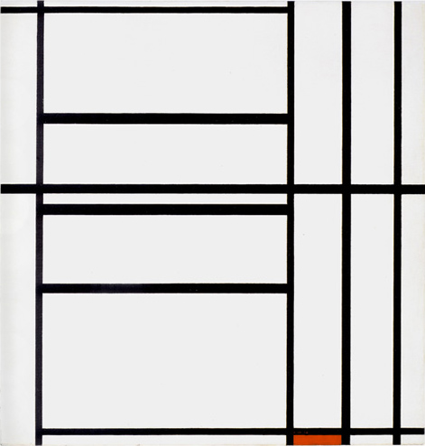
Composition N. 1 with Red, 1938-39,
Oil on Canvas, cm. 102,3 x 105,2
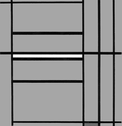
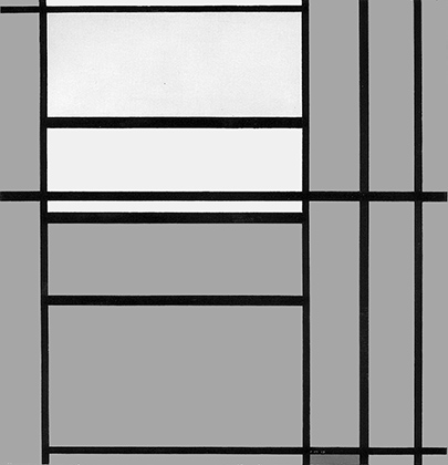
The marked presence of vertical lines on the right prompts a vertical reading of the horizontal sections inside the large vertical field in the center left. On observing these sections, we note that their vertical component gradually decreases little by little as we move up from the bottom toward the central horizontal line which is the only uninterrupted horizontal line present in this work. The other horizontals are in fact three segments set between the vertical lines and two in the lower and upper part that continue outside to the right and left respectively.
Reading from the bottom toward the center of the canvas, we see a composite area of square proportions (Diagram A) turning progressively into an horizontal white linear segment (Diagram B). This has the same thickness as the underlying horizontal black segment as well as of the continuous, i.e., virtually infinite black horizontal line above it. Planes (Diagram A) and lines (Diagram B), that is to say, finite and infinite space as well as white and black acquire the same value in the central area of the composition.
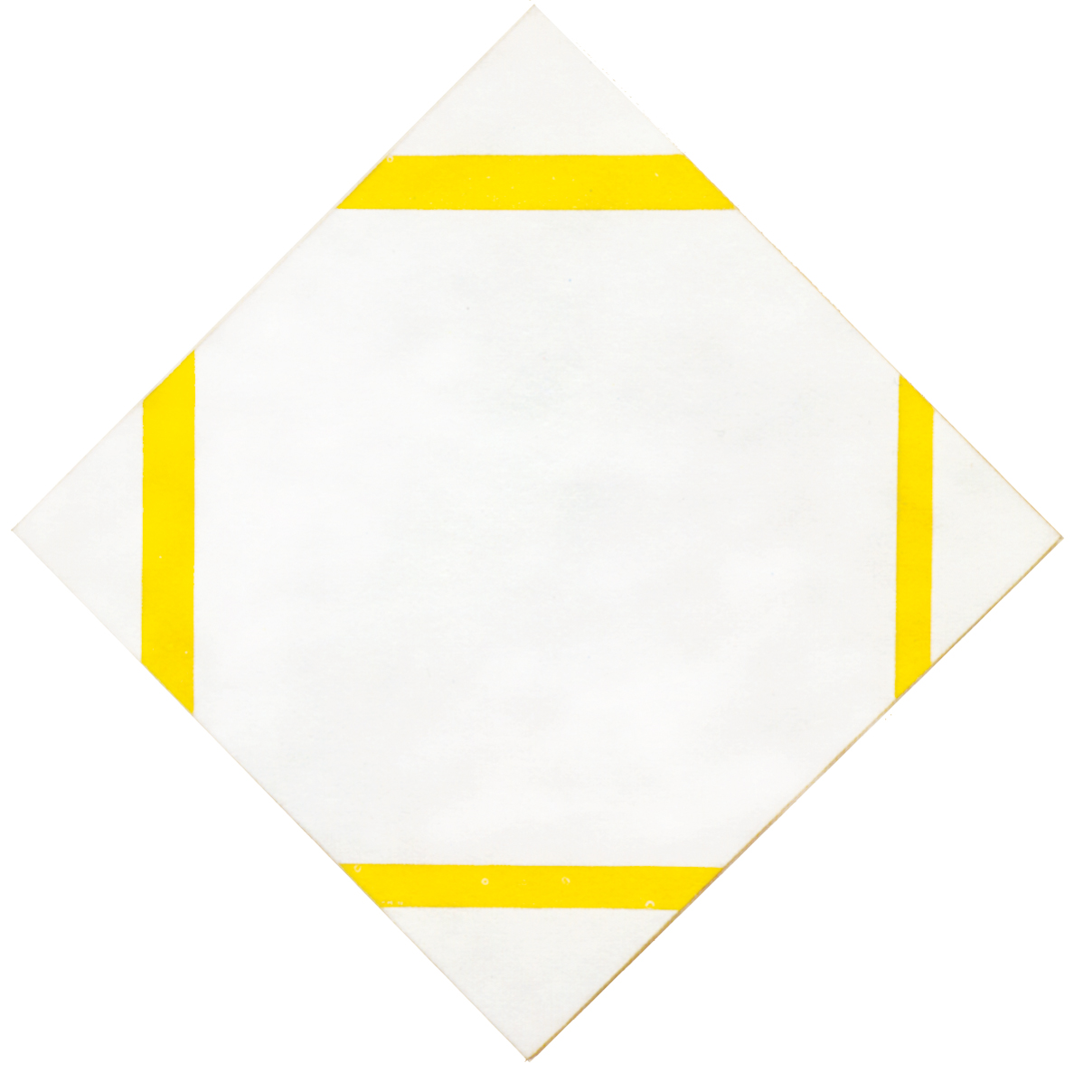
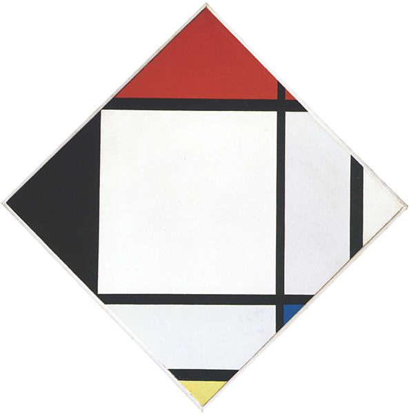
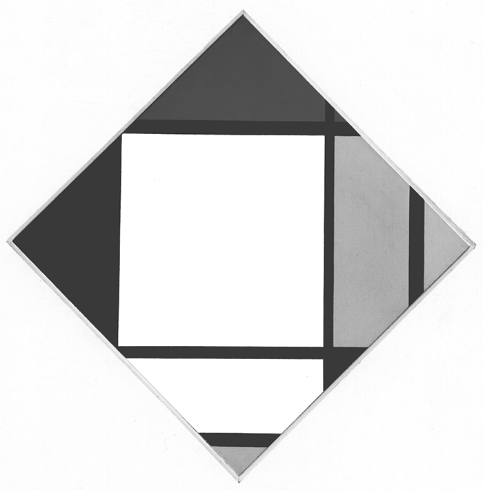
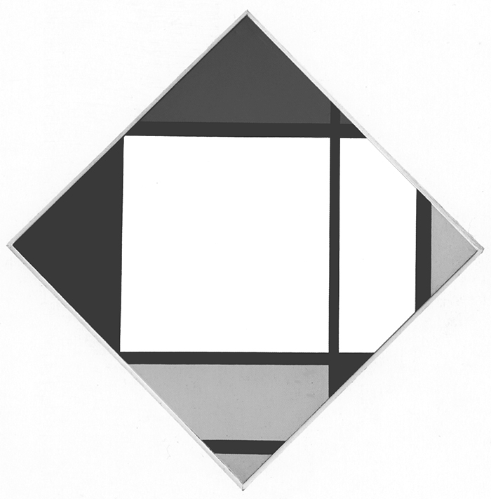
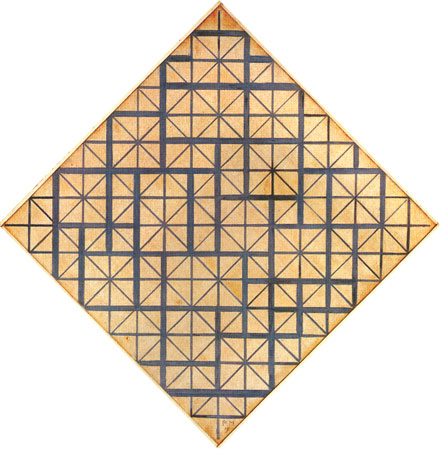
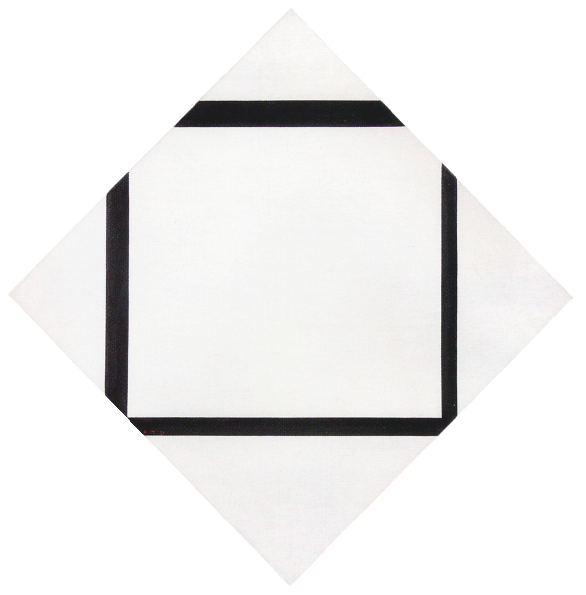
Six years earlier Lozenge with Yellow Lines shows an increase in the thickness of the lines that seemed to suggest their evolution toward potential planes while, in terms of color, yellow was used as an intermediate value between black and white.
While space becomes almost exclusively horizontal, proceeding from the bottom towards the center (Diagram A and B), the vertical component gains space again as we move from the center towards the upper part of the canvas (Diagram C).
Observe the contrast between the virtually infinite black horizontal line and the black segment beneath it. The latter appears slightly thicker as though the loss of extension of the continuous horizontal line was transformed into an increase in thickness of the segment below:

Composition N. 1 with Red, 1938-39
The concomitance of a straight line and a segment produces a space which simultaneously undergoes expansion and concentration. A measured red accent draws the eye toward the lower section and works together with the vertical lines on the right to reopen the space gradually accumulated toward the center. We are thus once again immersed in a vertical movement that gradually tends to become horizontal before reverting to vertical expansion. The red counterbalances and reopens the center, where opposite values (infinite and finite, black and white) attain dynamic equivalence for an instant.
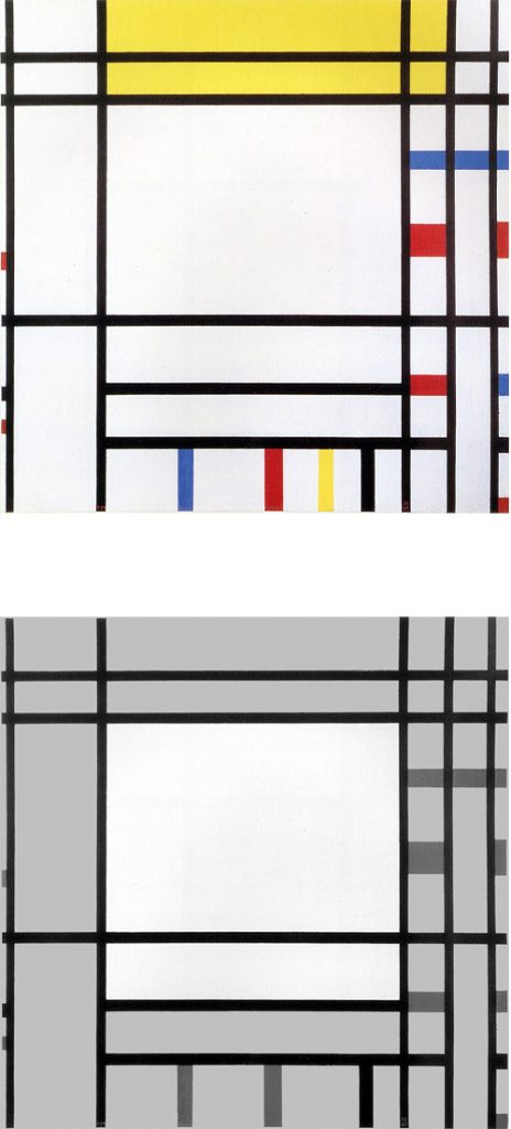
Trafalgar Square
Fig. 10 follows the same layout as the three works we have just examined with a vertical development of horizontal sections. These suggest an open and dynamic square form (Fig. 10 Diagrams A, B, C):
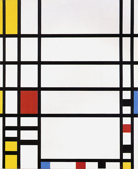
Trafalgar Square, 1939-43,
Oil on Canvas, cm. 120 x 145,2
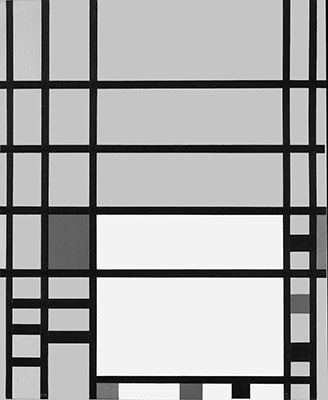
Diagram A
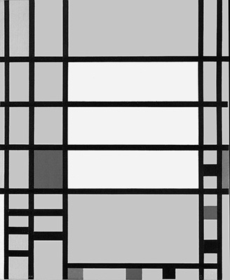
Diagram B
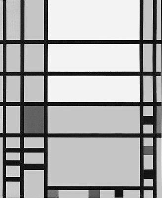
Diagram C
It should be borne in mind, however, that the composition was drafted in 1939 and the small accents of color present in the lower and right sections were added in 1942-43. The additions strike me as no improvement and indeed as spurious interference with the initial composition.
Mondrian named some works from this latter period after squares in cities where he had lived: London with Trafalgar Square, in another case Paris with a canvas named Place de la Concorde and finally New York City with the name of an avenue Broadway Boogie Woogie. Unfortunately, these titles have produced misleading interpretations.
The bombings in London put Mondrian’s nerves to the test. When he had been in New York for more than a year, he still felt the nervous shock of the bombings when a siren from some boat on the East River reminded him of the warning signal that sometimes barely preceded the fall of the machines. In spite of the isolation, the precarious life and the constant air attacks, he still hesitated to answer Harry Holtzman’s call.
Holtzman was only able to convince him with the news – which was not true – that the British government itself was about to reach Canada. Only then did Mondrian accept the ticket.
He took the boat at the end of September 1940 and arrived in New York on October 3. “He was very tired and weakened by the dangers and difficulties he had experienced,” writes Holtzman, “but with rest, good food and care, he soon recovered.”
Michel Seuphor, Piet Mondrian, Sa Vie, son Oeuvre, 1956
As mentioned, during this period Mondrian worked at some paintings which again present a large square generated in the central area of the composition:
Let us examine some of these works:
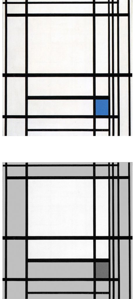
Composition des Lignes e Couleur III
Seven vertical lines meet six horizontal lines. To be more precise, all verticals are lines that ideally continue beyond the canvas while only one horizontal line shows a continuous space.
On the right margin of the composition four vertical lines approach each other. The white sections of space between these lines appear as planes tending to the proportions of white vertical segments:
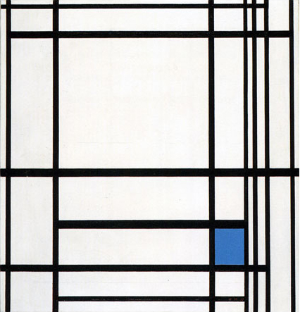
Composition des Lignes e Couleur III, 1937,
Oil on Canvas, cm. 77 x 80
We again see here a vertical field that proceeds from the bottom towards the top of the canvas (Diagram A). The vertical field is counterbalanced by a horizontal field in the upper area (Diagram B). The intersection of the two opposite fields generate an area close to a square (Diagram C):
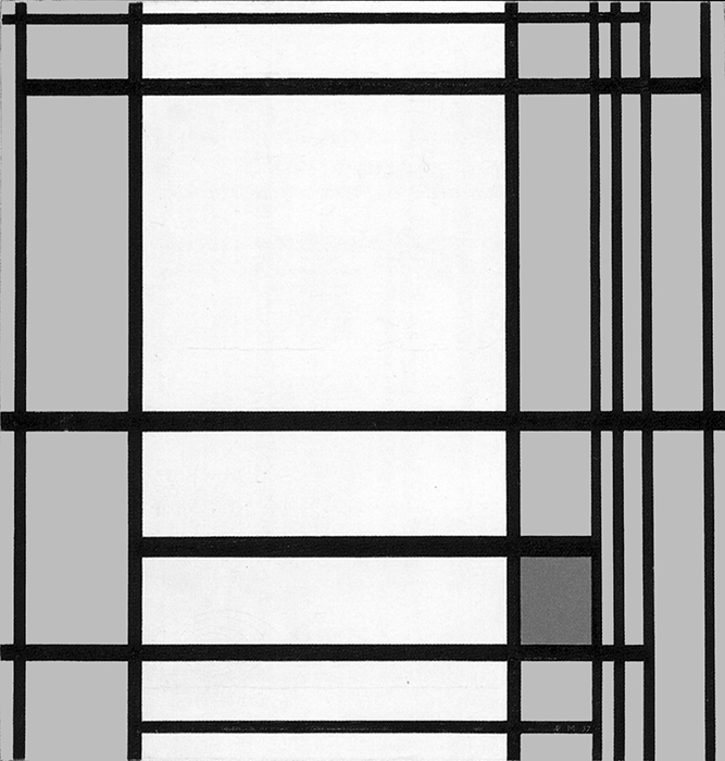
Diagram A
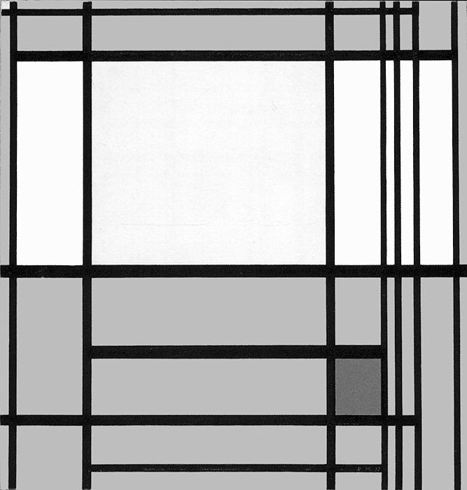
Diagram B
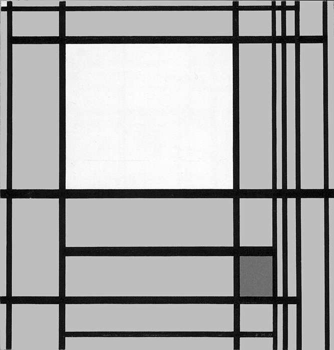
Diagram C
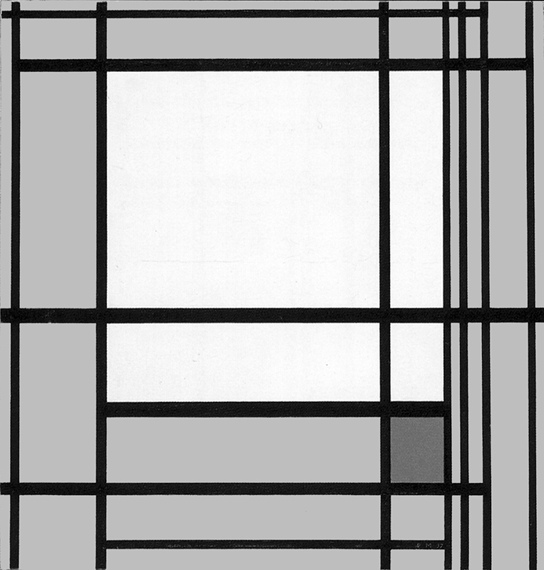
Diagram D
The small blue plane attracts the eye toward sthe lower right section drawing attention to a larger form which suggests for an instant a large square field (Diagram D). The central approximate square (Diagram C) shows a slight horizontal expansion while the large square (Diagram D) a slightly vertical predominance. Between the two we perceive a square that oscillates between horizontal and vertical prevalences, i.e., a dynamic equivalence of opposites which appears for a moment before overbalancing in one direction or the other.
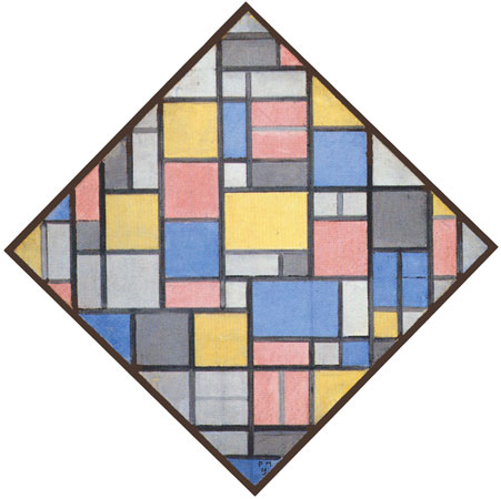
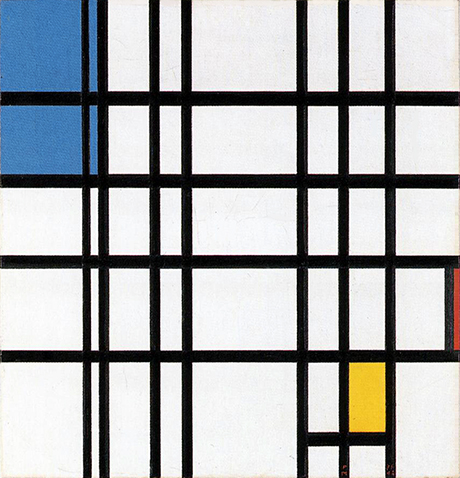
Lozenge Composition with Eight Lines and Red
Eight lines, differing in extension and thickness, suggest a dynamic, slightly more horizontal composite square field expanding towards the left while a red accent draws our attention towards the right:
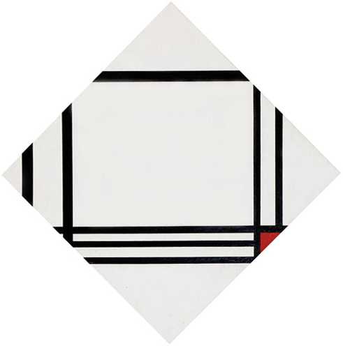
Lozenge Composition with Eight Lines and Red, 1938, Oil on Canvas, cm. 100 x 100
Compared with the earlier lozenge compositions, the probable square of Fig. 12 consists of a larger and diversified amount of parts. Another way to open up unity to multiplicity.
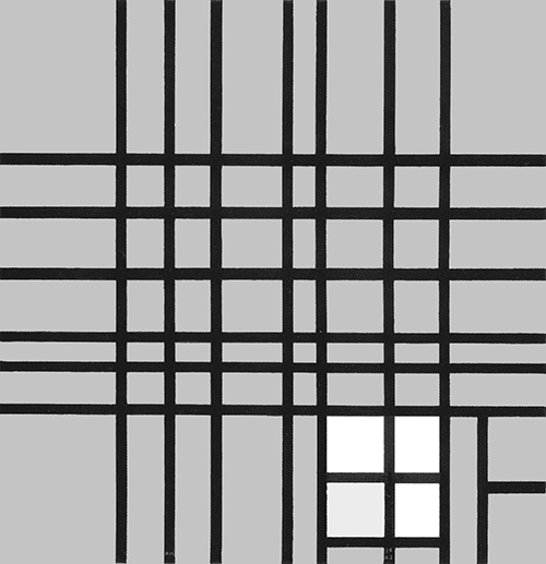
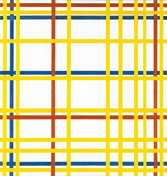
New York Boogie Woogie
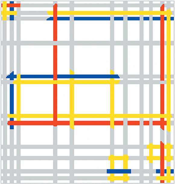
The lines of this work are no longer black only. Biographical information indicates that the painting was initially exhibited at a show in February 1941, at which time the lines were all black. The artist would then have added the red lines – or perhaps, more probably, painted some of the black lines red – during the autumn of the same year:
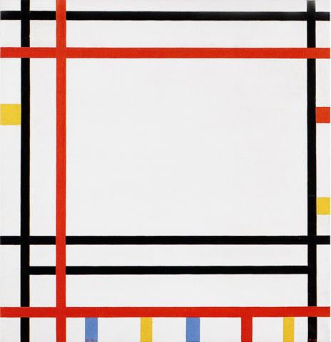
New York Boogie Woogie, 1941-42,
Oil on Canvas, cm. 92 x 95,2
Diagram A shows a horizontal proportion formed by black lines while Diagram B suggests a slightly vertical area formed by red lines. In Diagram C, the opposite directions approach equivalence, which is then reached in Diagram D:
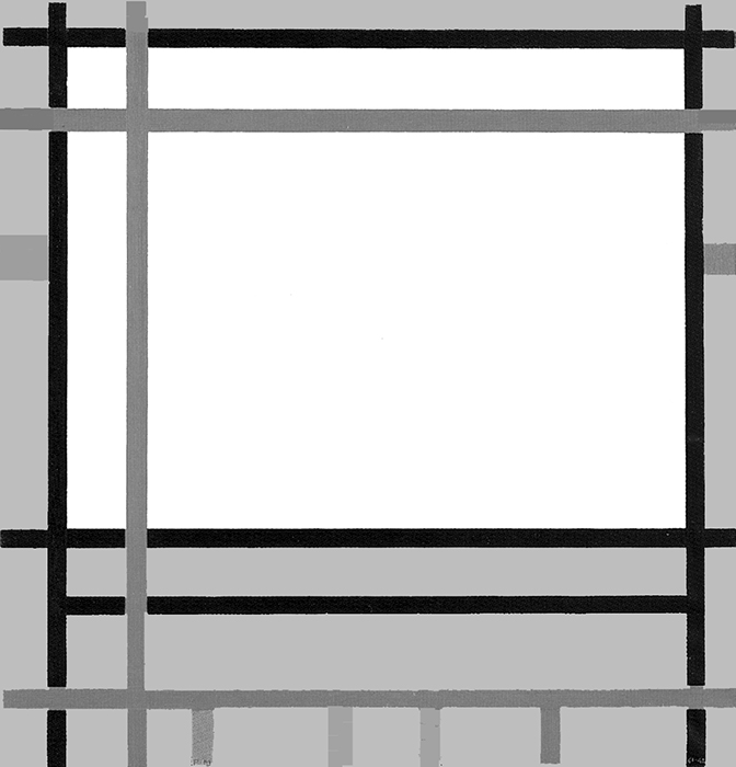
Diagram A
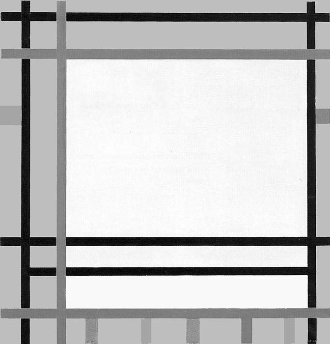
Diagram B
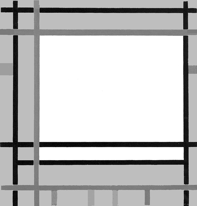
Diagram C
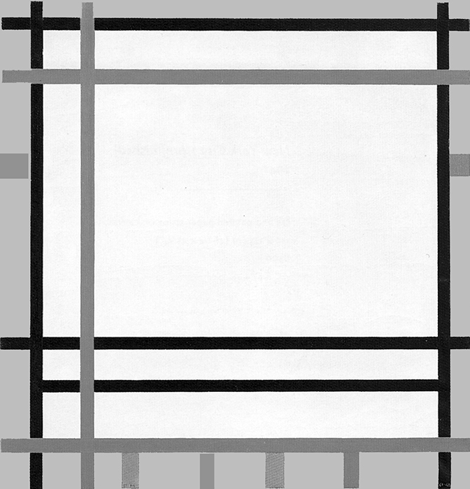
Diagram D
The composition shows probable equivalences in which one direction or the other shows a slight predominance without either coming to prevail completely and establishing a permanent condition. Everything reverts to the construction and deconstruction of unitary syntheses of the opposing directions,i.e., square proportions, which are of two colors in this case.
The accents of color that the artist must have added in 1942 (above all the small planes in the lower section) do not alter the composition significantly. They add “verticality” in an area that would otherwise be dominated by horizontals but serve above all to enrich the composition with color.
Traveling along the lines, the space opens up and then concentrates in the form of more stable relations that are then challenged again.
Here too, everything changes while something “between the lines” evokes a sense of greater equilibrium.
Summarizing the above
Let us now summarize the evolution of Neoplasticism during the 1930s.
We have seen some works where the square opens up and multiplies over the whole composition by continuously changing the relationship between the opposite directions:
while other works show a square in progress appearing and disappearing within a dynamic vertical field:
and other works reveal the need to maintain the visibility of a large square as the momentary result of a variety of interacting proportions:
We shall now find the three above shown compositional types merging together into one canvas – New York City (Fig. 15).
Let us for a moment see why this one painting can be considered a synthesis of the above mentioned works. In the next page we shall examine it in depth.
Fig. 15 Diagram A shows a multiplicity of horizontal and vertical rectangles as well as diversified square proportions (similar to this type of compositions):
Diagram A1 highlights a large square area as found in these type of compositions:
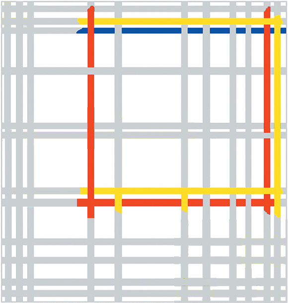
Diagram A1
Diagram B shows how a central square form is developed toward the centre inside a vertical field that runs from the bottom to the top of the canvas (like in these type of compositions):
With New York City (Fig. 15) Mondrian will reach a synthesis of all the compositions produced during the 1930s before reaching a marvelous synthesis of his entire oeuvre with Broadway Boogie Woogie and Victory Boogie Woogie Mondrian’s two last paintings which will be examined in the following pages.
Next page: Neoplasticism – Part 5
back to overview
Copyright 1989 – 2025 Michael (Michele) Sciam All Rights Reserved More
