Please note: If on devices you click on links to images and/or text that do not open if they should, just slightly scroll the screen to re-enable the function. Strange behavior of WordPress.
Between unity and multiplicity
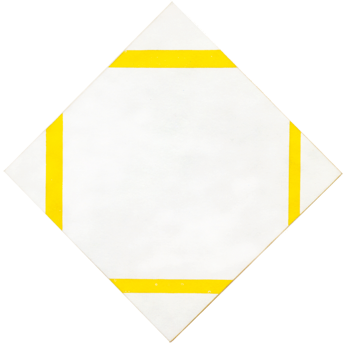
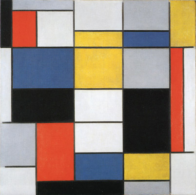
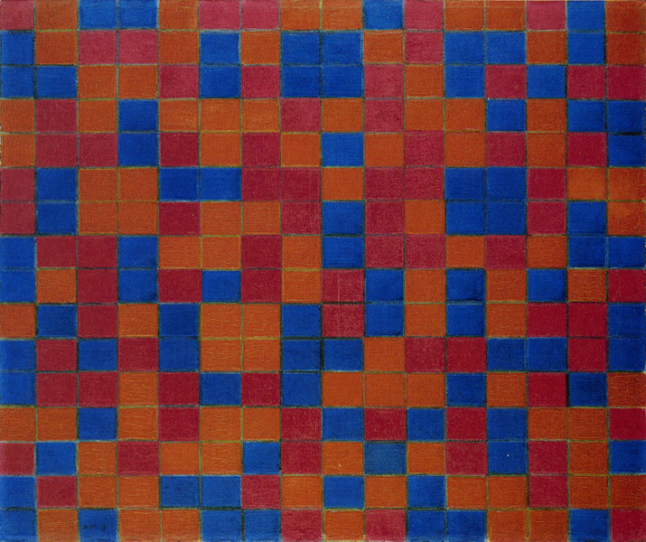
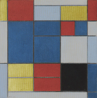
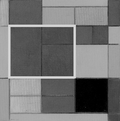
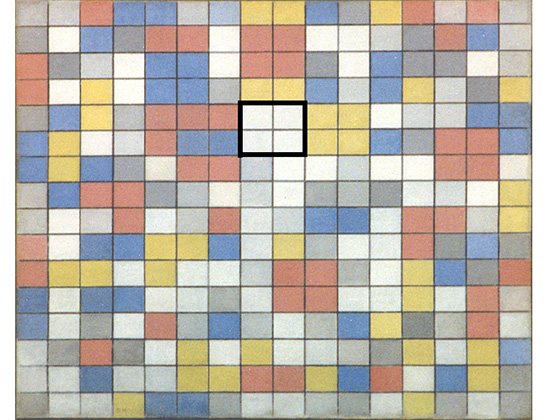
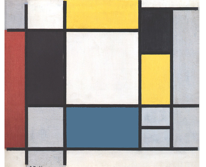
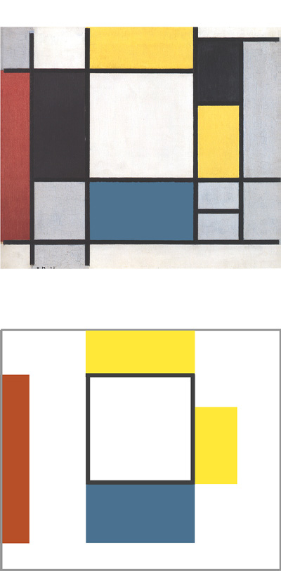
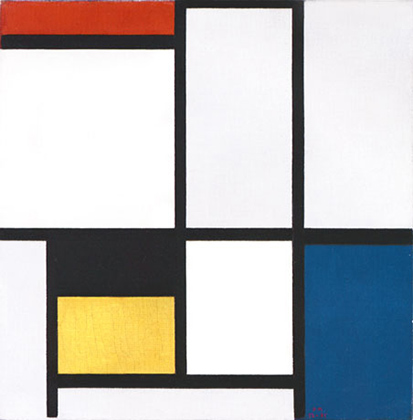
After the wholly regular grid-plan of the checkerboard compositions (Fig. 1), Mondrian embarked on a new series of works in which the formal layout opened up once more (Fig. 2):
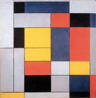
Composition II, 1920,
Oil on Canvas, cm. 100,5 x 101
Almost all the planes of Fig. 2 differ from one another in terms of form. A composition expressed as a chromatic variation of the same measurements (Fig. 1) gives way to a space where there is change also in the size and shape of each individual colored plane. Multiplicity is now expressed both through color and form.
Moreover, what takes shape in Fig. 2 is the distinction – initiated in Checkerboard with Dark Colors – between lines crossing the entire canvas and and lines that break off, i.e., linear segments.
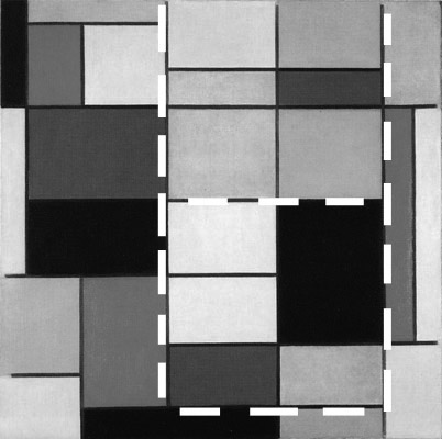
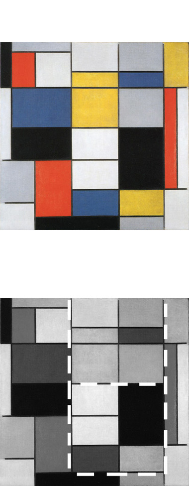
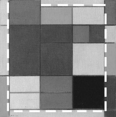
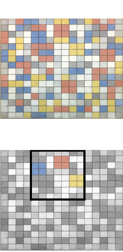
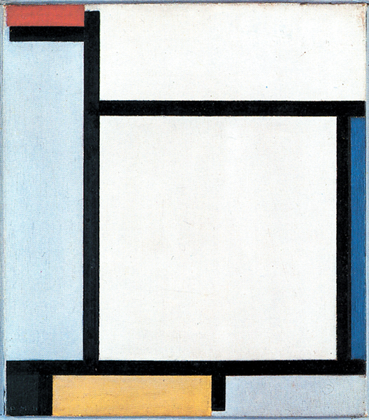
With respect to Fig. 2, where everything randomly changes, Fig. 3 presents a more homogeneous set of planes:
The planes highlighted in Fig. 3 diagram display analogous proportions whereas those outside this area are developed more freely. As a whole, those planes form a vertical field stretching from the bottom to the top of the canvas. The vertical field corresponds to two approximate square forms placed one above the other.
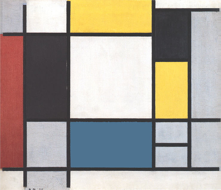
Observation of Fig. 2, 3, 4 in sequence reveals that the compositions tend toward a certain order. While everything changes in Fig. 2, part of Fig. 3 shows similar proportions that tend to unify the multiplicity of elements and even more so in Fig. 4:
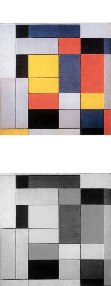
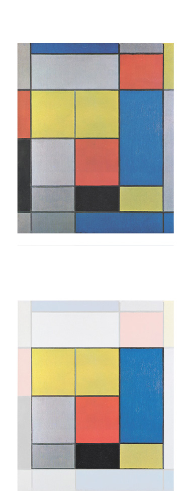
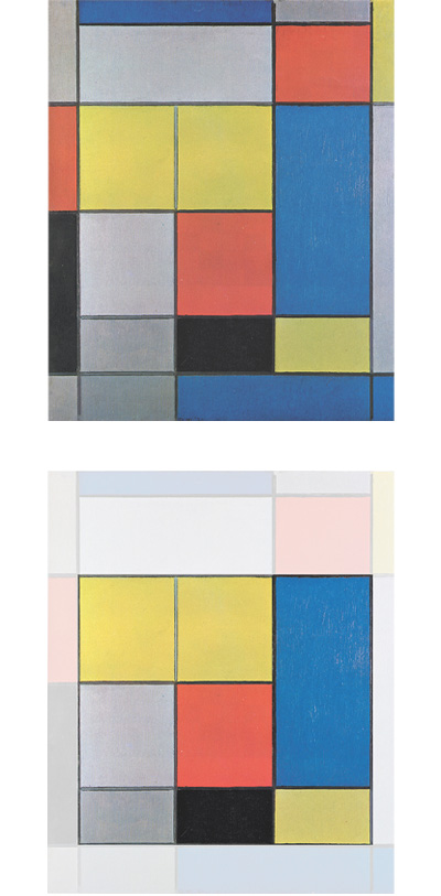
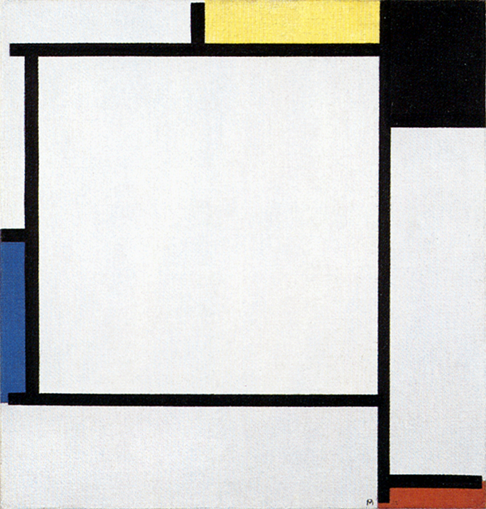
Let us examine Fig. 4:
Composition B
We note here two contiguous yellow planes of rectangular proportions verging on squares. The same shape reappears lower down once in red and once in light gray. On the right, a large blue area proves to be the sum of the initial module repeated twice vertically:
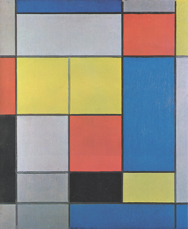
Composition B, 1920,
Oil on Canvas, cm. 57,5 x 67
Lower down we have three rectangles – one yellow, one black, and one dark gray – presenting proportions that are half the initial module. Though different both in color and in size, these planes are an expansion or contraction, either vertical or horizontal, of a pre-established unit of measurement.
A measured development
As in the lozenges of 1918-19 where a basic element “tends to form larger units” (Jaffé), a proportional development of space returns in these works. Now, however, it is only a part of the composition that reflects this layout, unlike the works of 1918-19, where the whole of the space was based on the same unit of measurement. In Fig. 4 the planes close to the edges of the canvas suddenly assume anomalous proportions that are no longer related to the module:

Composition B, 1920 with Diagram
After a phase of greater constancy to be observed in the central area, everything changes unpredictably elsewhere.
Returning to the eight planes that are wholly proportional to the basic module, we note that they form a large square when viewed all together. The square is slightly more horizontal to compensate for the vertical development of the canvas. The space in this square field displays a certain degree of constancy whereas everything changes around it.
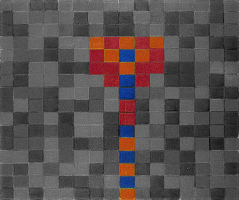
The space of Pier and Ocean 5 comes to mind:
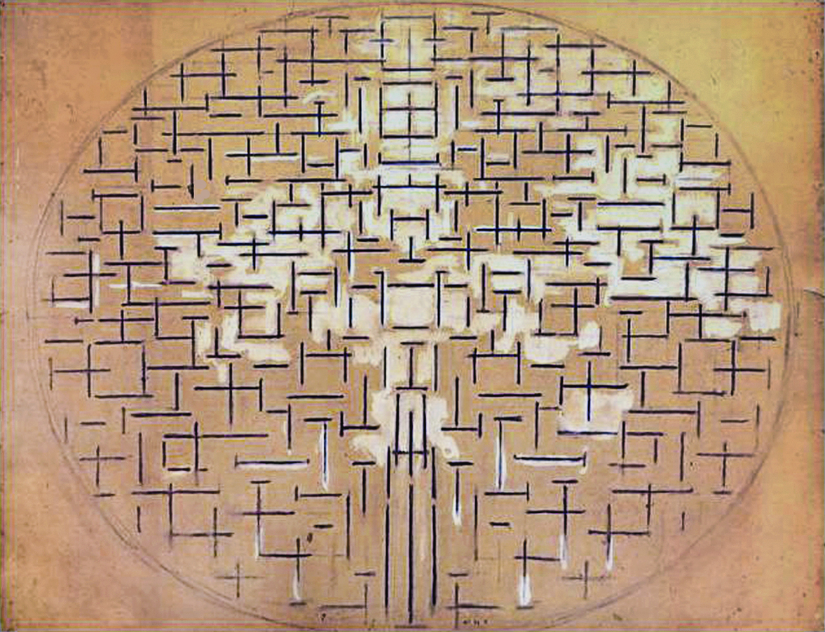
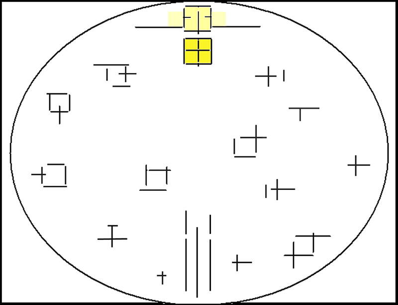
In the same way as a vertical segment (symbolizing the Spiritual) and a horizontal segment (symbolizing the Natural) are counterbalanced inside a square in the drawn space of Pier and Ocean 5, we see in Fig. 4 a square field made up of horizontal and vertical planes, colors and “non-colors”, i.e. the elements of the Neoplastic language used respectively to symbolize the Natural and the Spiritual:
As in Pier and Ocean 5, in Composition B everything changes around the central square.
With a large square visibly structured and colored within, Mondrian seeks in Composition B to present a unitary synthesis open to multiplicity, almost as though intent on effecting interpenetration between the white rectangular unity of Checkerboard with Light Colors and the three rectangles – one yellow, one red, and one blue – in its immediate vicinity:
In Composition B (Fig. 4) we contemplate a colored synthesis we have glimpsed at in Checkerboard with Dark Colors:
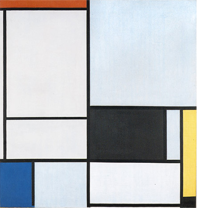
Composition C
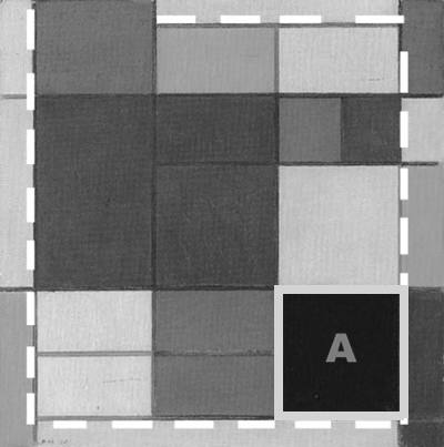
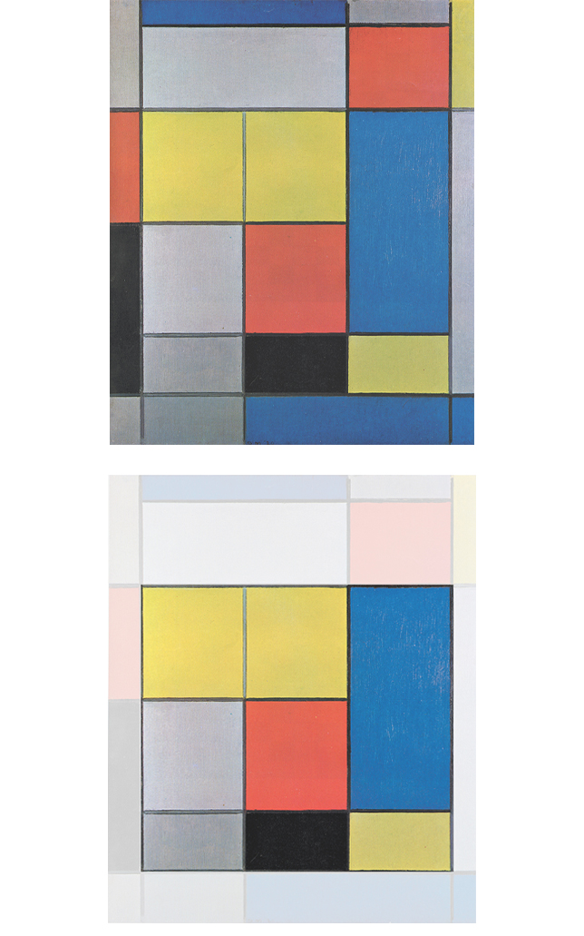
Similar to what we have observed in Fig. 4, Fig. 5 presents a central area of square proportions, which actually occupies almost the entire surface of the canvas (Fig. 5 Diagram A):
Fig. 5 Diagram B: As in Fig. 4 the central area of square proportions is formally organized in terms of the progressive growth or division of a basic proportional parameter (A):
As in Fig. 4, the planes outside the large square area outlined in Fig. 5 Diagram A are no longer based In the proportional parameter internal to the large square.
Colors influence the perception of form
The large square form appears to open up in the top left corner and expand upward through a red plane that is no longer based on the initial module. Observation of the red elsewhere shows how variations in size and proportion can make the same color look different. This is accentuated by relations with the neighboring colors. The red appears almost lighter alongside black than gray or yellow, next to which it appears to acquire greater weight and solidity.
The contrast between black and blue in the lower right section appears so faint (in the original more so than in reproductions) as to suggest continuity between one hue and the other and hence a reopening of the form. Chromatic value has, of course, an influence on the clarity with which the form is perceived.
In relation with one another
Things have no value in themselves but are defined and acquire value in relation to one another. It is not possible to single out an entity and appraise it independently of its context. A space of this nature can serve as a sort of gymnasium in perceiving the value of things as they take on relative and temporary qualities through reciprocal influence. Such space can be a stimulus to contemplation of the changing complexities of present-day reality.
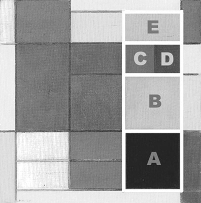
Fig. 5 – Diagram C: The two squares, one black (A) and one grayish-white (B), express a condition of equilibrium between opposites. The two squares are placed one above the other, one darker and heavier, the other lighter in both senses. The composition displays a balance of vertical and horizontal and of black and white in this area, i.e. a synthesis of opposites in terms both of form and of color:
Here too, however, as in Fig. 4, the synthesis is not concentrated in a single shape as it is in Checkerboard with Light Colors. but, instead, it is affected by the line-induced dynamism. Any attempt we make to arrive at stable and certain balances during our lives is always called into question by the unforeseeable progression of existence.
Fig. 5 – Diagram C: Above the whitish square we can see another square field of analogous proportions made up of a red square (C), a vertical blue rectangle (D) and a horizontal yellow rectangle (E). Added together, the three parts form a square made up of the three primary colors expressing a strong horizontal predominance (E), a light vertical prevalence (D) which then become an equivalence of the opposite directions (C). These are all unified by the larger square area (C, D, E) which evokes a dynamic, all colored and therefore relatively multiple unity.
A multicolored unity
Reading the composition again from the bottom up, we see a black square, a whitish square, and a third made up of yellow, red, and blue. These three squares give birth to a unitary synthesis dynamically transposed into the vertical. Proceeding vertically from the bottom of the composition, we have the two opposite values (black and white square forms) that open up to the three primary colors, as well as to variations in the vertical-horizontal relationship (D and E).
With the three vertically placed square forms (A, B, C, D, E) we contemplate a dynamic synthesis of elements which Mondrian identified as plastic symbols for the Spiritual (vertical, white, black) and for the Natural (horizontal, yellow, red, blue):
Mondrian again seeks here interpenetration of unity and multiplicity.
Because they are chromatically so heterogeneous, however, the large square of Composition B and the superimposed squares of Composition C (A + B + CDE), which should express unity, do not manifest themselves with sufficient clarity.
He now needs a synthesis manifested with greater visibility. Once again the artist is searching for a balance between multiplicity and unity.
Fig. 5 Diagram D: A large blue area is made up of a square and two rectangles, one horizontal on top of the square having proportions half as large as the square and one vertical to the left of the square having proportions 1.5 times the square parameter:
The blue area predominates with respect to the others and seems intent on presenting a single plane holding for the composition as a whole. The blue area seems to suggest synthesis more effectively than the large, composite form highlighted in Diagram C. The large blue area has predominantly horizontal proportions to compensate for the vertically shifted synthesis to its right.
As mentioned, what we have just seen in Composition B and Composition C is what Mondrian had already attempted in a different way with Checkerboard with Dark Colors, where the space does not concentrate into one plane (like in Checkerboard with Light Colors) but remains poised between multiplication on the one hand and a tendency toward constancy and synthesis on the other:
This is why I consider the Checkerboard with Dark Colors as an intermediary stage between Checkerboard with Light Colors, Compositions B and Composition C.
When van Doesburg talked to Mondrian about founding an art magazine, Mondrian was initially reluctant. He thought that the times were not ripe, that Doesburg should be satisfied with a column in a small newspaper and that the spread of new ideas could only go slowly, gradually. Nevertheless, van Doesburg’s entrepreneurial spirit won out and in October 1917 the first issue of De Stijl was published.
When Mondrian returned to Paris in February 1919, the magazine De Stijl regularly published monthly sequels to essays written by the artist. Eager to make his ideas known to the French, Mondrian had been writing more than he painted for over three years. He got help for the translation and publishes in 1920 at his own expense a brochure entitled “The Neoplasticism” that however did not arouse the hoped for interest also because of a rather clumsy translation. The publication will also be ignored by art critics.
Michel Seuphor, Piet Mondrian, Sa Vie, son Oeuvre, 1956
Recap
Evolution of unity
The opening of the unitary synthesis (evoked by the square unit) to multiplicity (different proportions and colors) we have just examined in two compositions dated 1920 (Fig. 4 and 5), can be traced back to 1915. As we have seen in Pier and Ocean 5 the synthesis evoked by a square opens up to duality and then flows back into multiplicity in the upper section of the painting (Fig. I):

Pier and Ocean 5
1915

Diagram
Following this indication, the unitary synthesis symbolized by the square seeks interpenetration with manifold colored space while preserving itself in the central area through a white square field that serves as an ideal synthesis of the colors (Fig. II):
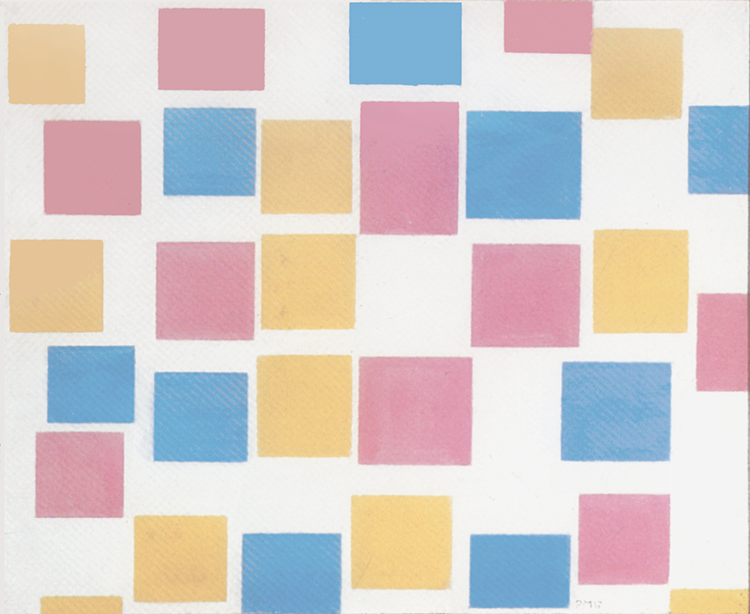
Composition with Color Planes 2
1917
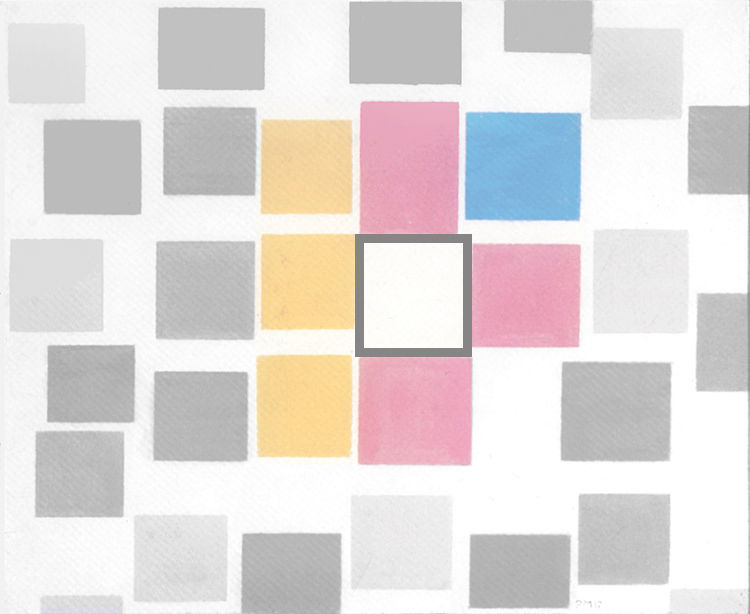
Diagram
The synthesis reappears for a moment as a white rectangle (Fig. III):
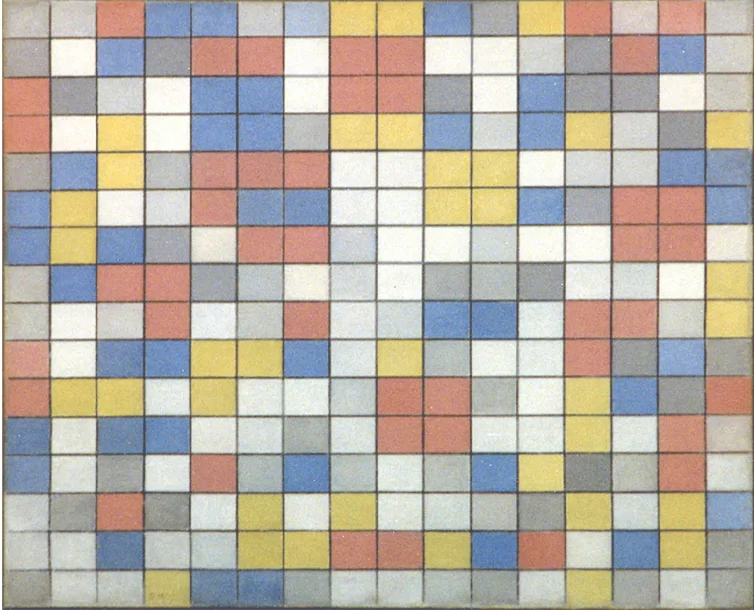
Checkerboard with Light Colors
1919
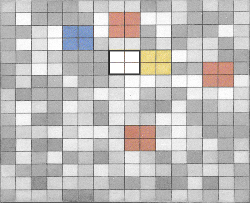
Diagram
Note how the painter always places the unitary synthesis in the center of the composition in order to highlight its importance.
The synthesis reappears for a moment as a white rectangle (Fig. III) and opens up again as a large square to a variety of forms and colors (Fig. IV) as if intent on effecting interpenetration between the white rectangular unity of Fig. III and the three rectangles of color in its immediate vicinity:

Composition B
1920
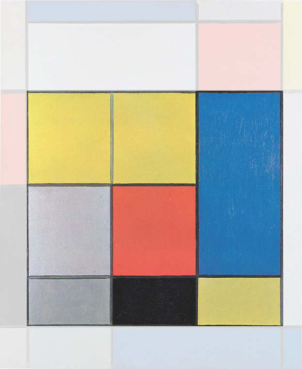
Diagram
Between 1915 and 1920 the multiplicity expressed by means of small black dashes (Fig. I) becomes a multiplicity conveyed by planes of different colors. In a span of five years the drawn square (Fig. I) becomes a colored one (Fig. IV) in a bid to express both unity and multiplicity at the same time:

Pier and Ocean 5,
1915
Diagram

Composition B
1920
Diagram
Unity and multiplicity
In Mondrian’s view, any synthesis worthy of the name must take shape visibly in all the parts it wishes to represent. The one and the many, the permanent and the mutable i.e. the Spiritual and the Natural are for Mondrian different or rather opposite aspects of the same unique reality that he would almost like to be able to show simultaneously.
I have used the example of a tree looking like a simple patch of color when observed from a certain distance but revealing a far more complex structure on closer examination. Moving in the opposite direction, the complex structure of a tree once again returns to a condensed patch of color.
There is a constant alternation of unity and multiplicity in our experience of everyday life. It depends on our point of observation if one thing looks small and simple and another large and complex. This applies not only in seeing tangible things around us but also in considering existential situations. Indeed, we often tend to simplify what is actually far more articulate and complex.
Small and simple, large and complex: These adjectives have no meaning in themselves, as Oriental wisdom teaches: “Infinitely small things are as large as only large things can be because external conditions do not prevail here. Infinitely large things are as small as only small things can be because objective limits are immaterial here.”
The need for a visible unity
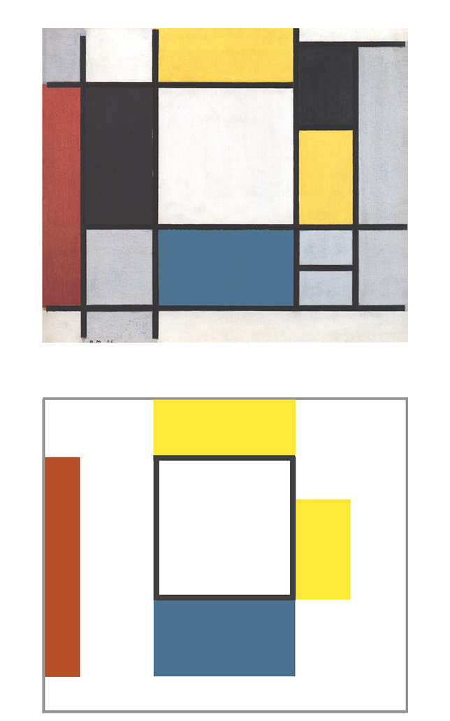
Composition B (Fig. 4) and Composition C (Fig. 5) try to express the manifold and the variable in a measured form through a proportional constant parameter and, at the same time, convey a sense of unity (the square form) consisting of a multiplicity of different parts:
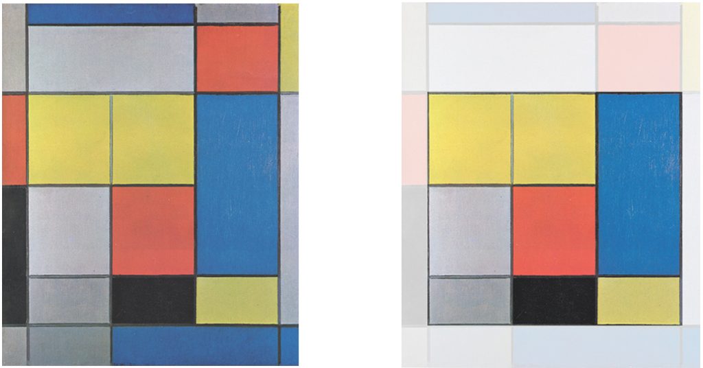
Composition B, 1920 with Diagram
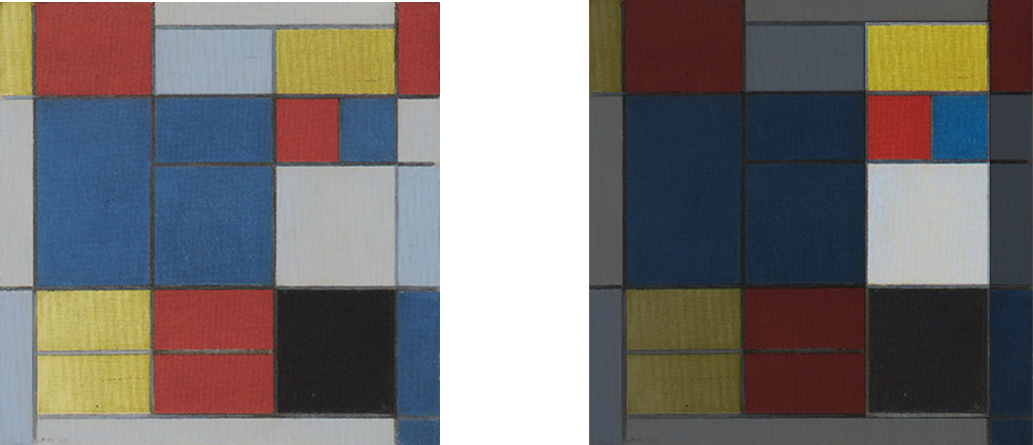
Composition C, 1920 with Diagram
Because they are chromatically so heterogeneous, however, the large square of Composition B and the superimposed squares of Composition C, which should express unity, do not manifest themselves with sufficient clarity and that’s why in a following canvas the square unit turns again into a more evident homogeneous white field defined by black lines (Fig. 6):
Mondrian thus returns to using white to highlight the unifying synthesis as in 1917 and 1919:

1917

Diagram

1919

Diagram
The large square of Fig. 4, evoking a composite unity, can be seen as purging itself of the planes of various sizes, proportions, and colors that make it up to become a homogeneous white field defined by black lines while the three primary colors (symbolizing the Natural) return to the outer area.(Fig. 6):
A greater level of synthesis
The square area in the center of Fig. 6 suggests a certain parameter of constant space, whereas all the rest displays free variation of the perpendicular relationship oscillating between the predominance of one direction or color and another.
In short, Mondrian returns here to the conception of unity expressed in Fig. 1, i.e., a unity of the two opposite values, black and white, but with the substantial difference that, with respect to Fig. 1, the composition has now become wholly asymmetric and the sense of uncontrolled variation is no longer expressed solely through color but also through form:
Observe the sequence below. All the variety of Fig. 1 is gradually reduced until all that is left in Fig. 6 is what could be interpreted as a part of Fig. 1 on which the painter seems determined to concentrate. This part includes the white unity and three planes, each in a primary color and each now differing from the others in size and shape (Fig. 6):
There is a choral sense of variation in Fig. 1 with a large number of equal shapes varying in appearance only through color while the form remains unchanged. The new canvases (Fig. 4 and 6) present a smaller number of parts that vary both in form and in color to make every point in the space unique and unrepeatable. There is a decrease in the number of parts but an increase in their reciprocal diversity. The sense of multiplicity expressed in primarily quantitative terms (Fig. 1) now gives way to a sense of multiplicity expressed through difference in qualitative terms (Fig. 4 and 6).
The layout of Fig. 6 was to become the model for nearly all the canvases painted by Mondrian during the early 1920’s, where the compositions develop a large white square defined on four sides by black lines and placed in a state of dynamic equilibrium by asymmetric fields of whitish, gray, yellow, red, and blue planes differing in size and proportions:
Every canvas of 1921-22 expresses space in a state of unstable equilibrium between a variety of heterogeneous situations and a component tending toward greater uniformity and constancy. Each part seeks to distinguish and separate itself from the others. The space grows and multiplies through diversification while remaining more homogeneous in the center, where all the variation in shape, size and color between the two opposite values – horizontal and vertical, white and black – find a synthesis in the white square area marked by black lines.
The square form
Mondrian does not see the square form as a closed and pre-established geometric shape but rather the given moment in which the relationship between opposites (horizontal and vertical) attains a certain balance which is then lost when they again start to challenge and attain predominance over one another. The balance between opposites is of a dynamic nature same as the equilibrium between contrasting impulses we often search within ourselves.
Certain critics have often stressed the geometric aspect of Neoplastic painting, thereby prompting reactions on the part of others who reject the reductive view of Mondrian’s art as “geometry for its own sake”. This may be because few have really understood the marginal role actually played by geometric schemata in the evolution of Mondrian’s visual thinking and in the work of true abstract painters in general.
Around 1925 Theo van Doesburg introduced what he called Elementarism in his new works: the composition based on the diagonal.
Mondrian, who had regarded van Doesburg as one of the few people with whom he had a close spiritual affinity, was bitterly disappointed by van Doesburg’s failure to understand the dynamic equilibrium of opposites (horizontal and vertical) Mondrian had set forth as a fundamental element of his work and De Stijl. The artistic break with van Doesburg was definitive; on a personal level, however, they resumed contact some time later.
In the spring of 1925, the art critic Paul Sanders is in Paris and frequently visits Mondrian in his studio. The painter entertains Sanders by telling him about the great potential of radio and phonographic music reproduction, jazz, and electronic music.
Michel Seuphor, Piet Mondrian, Sa Vie, son Oeuvre, 1956
In the compositions of the early 1920’s the lines stop short of the edge of the canvas (Fig. 7, 8, 9 and 10), as though Mondrian wanted to make the colored planes more independent and give greater freedom to color, which is defined and limited on the canvas but expands freely in the vicinity of the edges and outside, that is to say, towards the real world, that is, where forms and colors often chaotically interact with one another. The canvas instead is the place where all forms and colors are distilled and come together in harmonious ways.
Multiplying unity
In Fig. 10 to the right of a large red square and to the right of a smaller black square below (2), we see, respectively, a slightly more horizontally developed whitish square field crossed by a vertical segment (4) and a slightly more vertically developed grayish square field crossed by a horizontal segment (3):
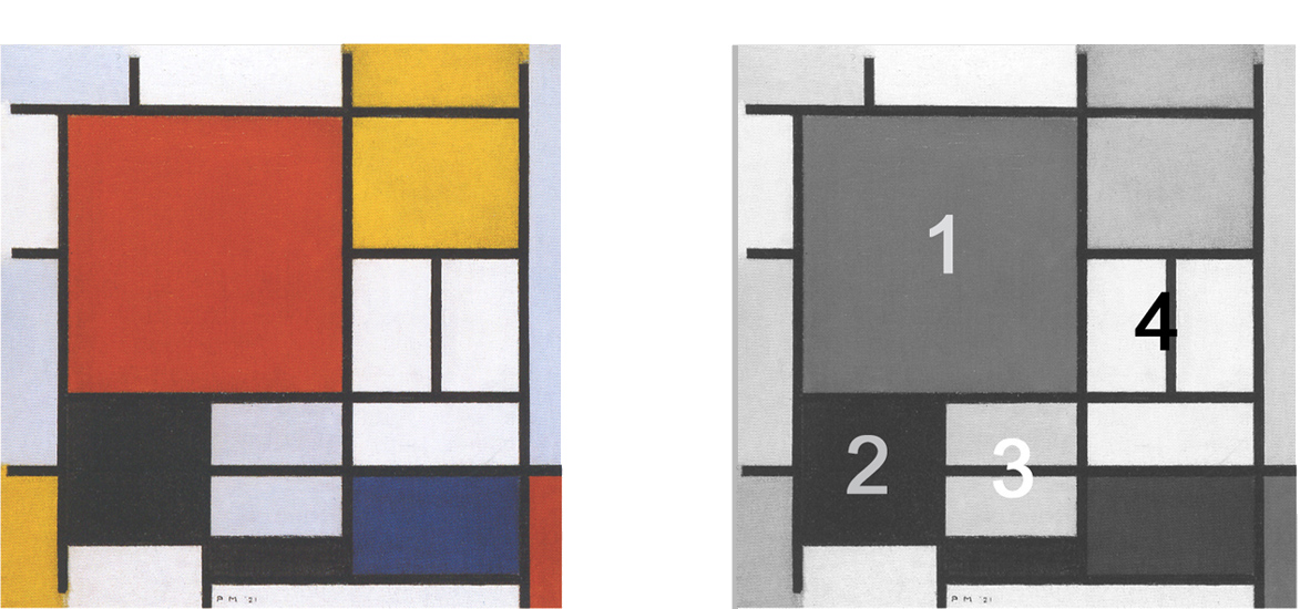
Composition with Large Red Plane, Yellow, Black, Gray and Blue, 1921, Oil on Canvas, cm. 59,5 x59,5 with Diagram
This too is a way of evoking a sense of variation while keeping the space comparatively constant by means of a same configuration (a square basic concept) changing position, proportions, and colors. At the same time it is a way of expanding the one (the square unit) towards a multiplicity of different situations in which, however, a trace of the one remains. The multiple refers back to the one and the one opens to the multiple.
Everything seems subject to change in these compositions in terms of form or color. The space is in motion. More balanced syntheses are generated every so often (Fig. 10 and Fig. 11).
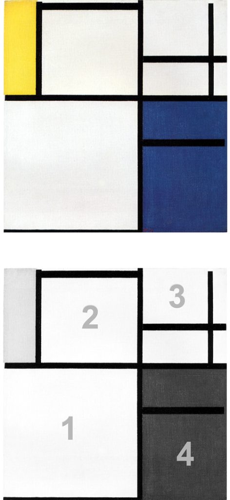
Composition with Yellow, Blue and Blue White, 1922, Oil on Canvas, cm. 53,3 x 55,3 with Diagram
Fig. 11: A horizontal segment, i.e. an element of form, defines a square proportion) in the lower-right corner while color blue reopens it upwards. Elsewhere It is instead color that generates a large blue square field dissolved by form (Fig. 12).
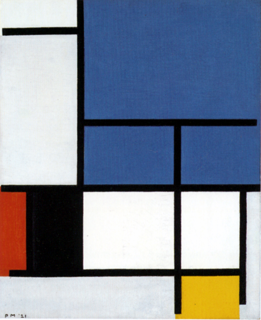
Composition with Large Blue Plane, Red, Black, Yellow and Gray, 1921, Oil on Canvas, cm. 50 x 60,5
Around 1922 the artist glimpses a space that is asymmetric, dynamic, and comparatively manifold and yet capable of expressing synthesis and permanence: The square shapes that stand out through color or expand with color while form brings them back into proportion or open up on one side and then close to attain greater clarity of expression are all ways of expressing a space that simultaneously evokes variety, asymmetry and unforeseeable dynamic expansion on the one hand and a tendency towards concentration and equilibrium among opposite on the other.
The square unit is stirred by an asymmetric distribution of colored planes of various size and proportions. This way the artist suggests the uncertain and temporary nature of our attempts to find balance and unity of opposites (the square proportion where horizontal and vertical attain equivalence).
Every Neoplastic composition expresses this dialectic between the contradictory aspects and the unforeseeable flow of existence in everyday life and the human need to stabilize them and find something of greater constancy and duration. A square form keeps space constant while differences in size, proportion and color change it.
In 1921 financial problems induced Mondrian to consider abandoning painting altogether. However, various friends in Holland helped him to obtain commissions either for copies, watercolors and drawings of flowers which finally enabled him to keep his head above water.
In the same year a painting by Mondrian was included in the exhibition “Les Maitres du Cubisme” organized by Léonce Rosenberg at his Galerie de l’Effort Moderne in Paris. Rosenberg, unable to sell Mondrian’s work, promised Mondrian the purchase of six paintings. This promise was not kept because of the failure of the exhibition.
In 1923 Mondrian met the Belgian writer, poet, painter and art theorist Michel Seuphor who became Mondrian’s colleague and friend. In the first Mondrian biography (1956) Seuphor writes: “Once he had laid the foundations for the new language called Neoplasticism, Mondrian worked to explore all its possibilities without ever exhausting its potential. How many times, during this long Parisian period, did I have to listen to comments referred to Neoplastic compositions such as “laziness of spirit”, “stupid stubbornness”, “incapacity for renewal” etc.? I used to caricature these kind of remarks by ironically stating that Mondrian did in fact repeatedly paint only one work.”
Michel Seuphor, Piet Mondrian, Sa Vie, son Oeuvre, 1956
Unwittingly, the clever irony of a fine man as Michel Seuphor was, hit the nail on the head since it is entirely true that Mondrian searched his entire life for a one painting. A single image that could represent everything the artist had always wanted to express since his early naturalistic period. This one image materialized with his last completed canvas in 1943, Broadway Boogie Woogie. We will see how this was progressively realized in a forthcoming page devoted to this masterpiece. (My note)
Other compositions of the same period present a medium-sized or large white square that is left open to the upper right corner (Fig. 13) or to the left (Fig. 14):
Some canvases of this period display splendid subtle variations of gray, whereas the yellows, reds, and blues sometimes appear understated.
After trying to express both the one and the many at the same time, Mondrian ended up once again highlighting a large white square, made more dynamic and asymmetric by a variable set of white and colored areas around it (Fig. 15 and 16). The one and the many influenced one another reciprocally while remaining here clearly separate:
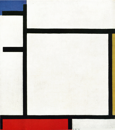
Composition with Blue, Yellow, Red and Gray, 1922, Oil on Canvas, cm. 34,8 x 38
The continuous interaction between horizontals and verticals, that produces open and unstable situations elsewhere, is transformed into interpenetration that generates balance and harmony with the square.
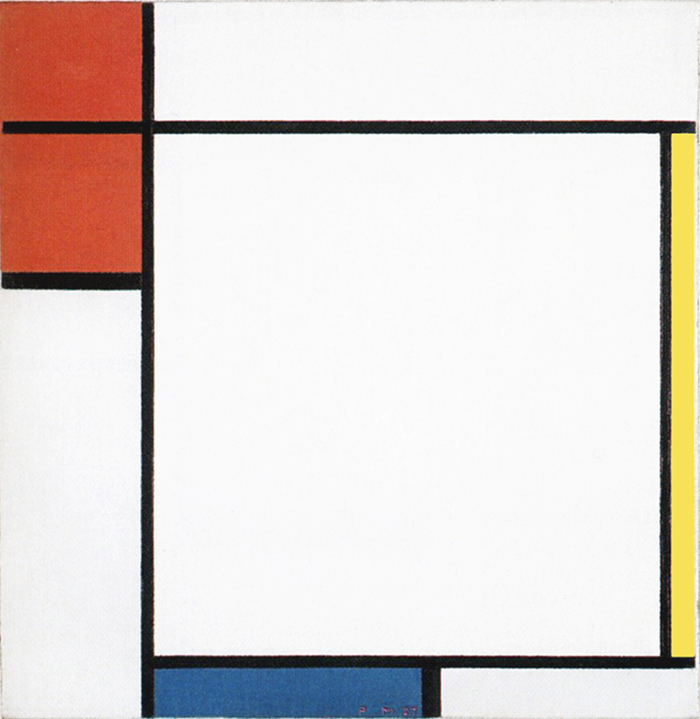
Composition with Red, Yellow and Blue, 1927, Oil on Canvas, cm. 51,1 x 51,1
All these works show Mondrian’s endeavor to compenetrate the human desire for balance and certainty (the square proportion) with the unpredictable variety of life (imbalances between horizontals and verticals of changing color) without sacrificing either aspect.
A vision of the whole
Even when the square ratio seems to prevail, the balance of the composition is influenced by all the elements and not only by the square. Every part is unique and unrepeatable but nevertheless contributes to the overall economy of the work, and it is precisely a vision of the whole that determines the relative value of each individual part. It is important to reassert that we use the word „square“ to describe a dynamic and temporary balanced relationship between horizontal and vertical and not a preconceived geometrical form.
Every square proportion of each individual composition is different from the other according to the context: here we see a slightly more vertical square and there a square which slightly expands horizontally. Mathematics have nothing to do with Neoplastic space.
Heaven or hell
There are no elements in Neoplastic space endowed with absolute validity. It is therefore not the square in itself but the whole, i.e. a space that starts from a condition of change, attains momentary equilibrium, and then flows back into the unstable alternation of situations. If constancy predominates, the space is atrophied in a static square and bears little resemblance to life. Conversely, if change prevails, the space is in danger of becoming chaotic and appeals less to the human mind.
The subtle balances produced in Neoplastic space are a transposition of the far more complex and never achieved equilibriums of existence. How many times in our lives have we had the impression of being able to attain a stable and lasting balance that is then always challenged by existence? We often suffer imbalances between the opposing impulses of instincts and mind and we would always like to find a durable balance and unity of our being, that is, our own inner paradise.
Many times during an existence one can reach paradise and many times one can find oneself in hell; what Mondrian called the tragic; when duality (diabolus) (from the Greek dia which means “through” and ballo which means “to put in the middle, to separate”) lacerates the integrity of consciousness and unity is lost. Transposed into visual terms unity is lost when the balance between horizontal and vertical (the square proportion) is lost, the horizontal prevails and dominates over the vertical and vice versa.
Next page: Neoplasticism – Part 2
back to overview
Copyright 1989 – 2025 Michael (Michele) Sciam All Rights Reserved More
