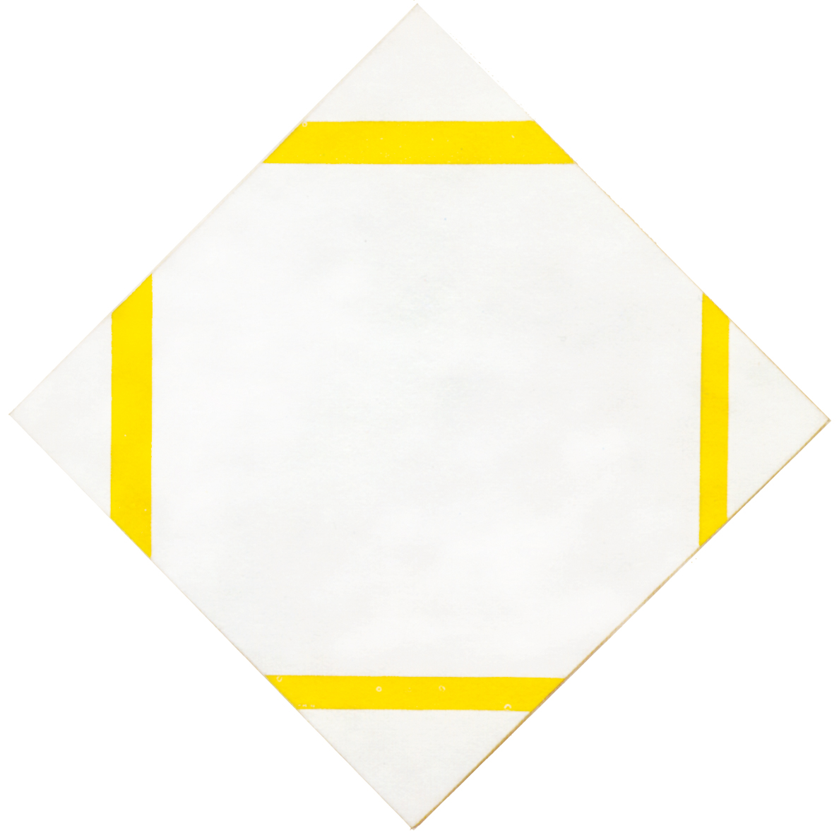
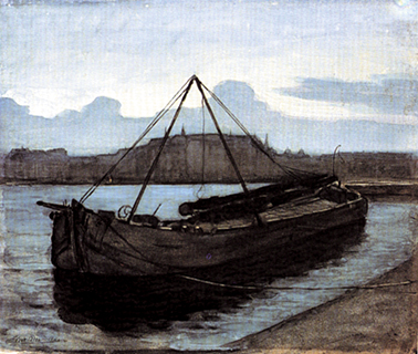
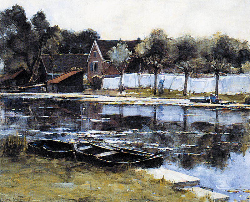
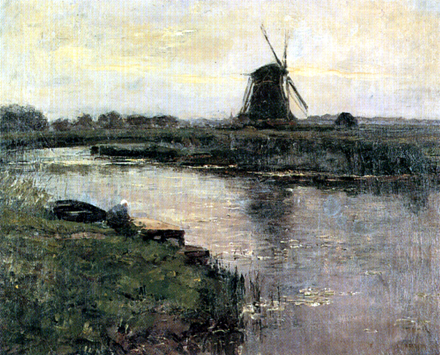
This page presents the major steps of Piet Mondrian’s oeuvre evolution process from the first naturalistic paintings up to the last Neoplastic abstract compositions.
The visible
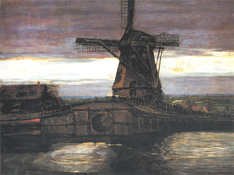
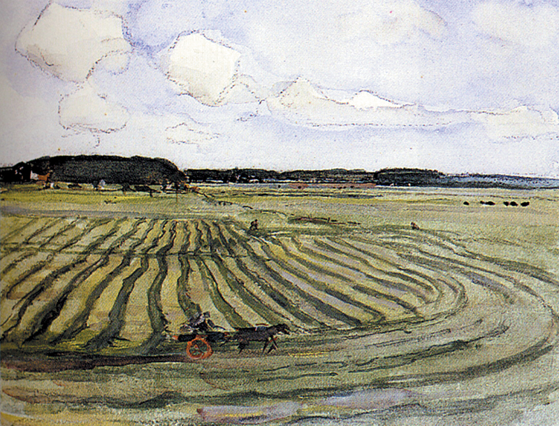
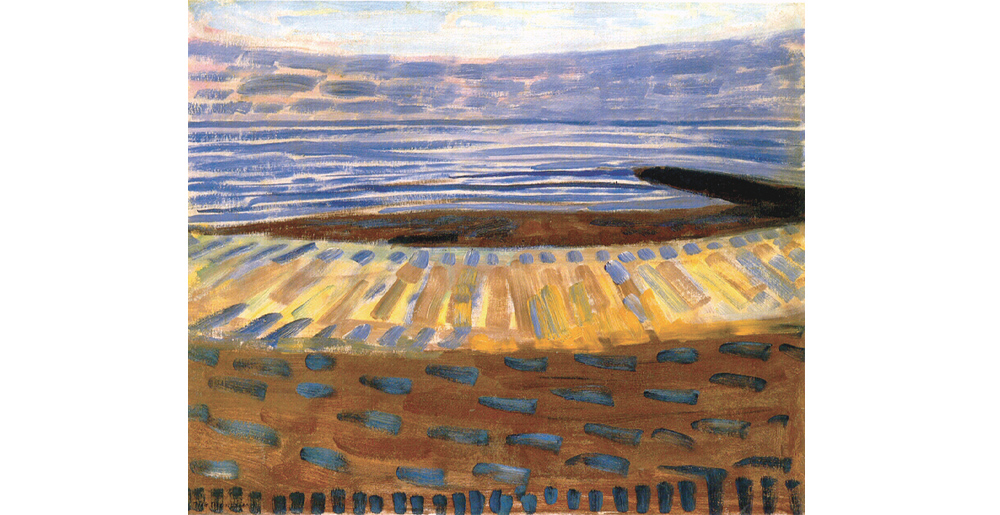
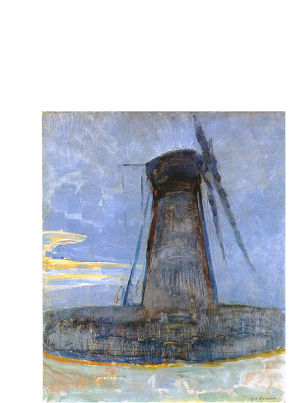
The artist begins to paint in accordance with the tested canons of the naturalistic painting, otherwise called figurative:
Interpreting the visible
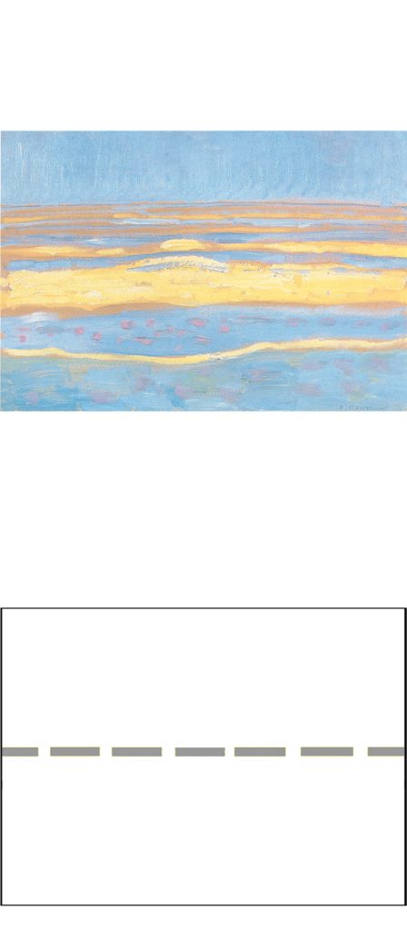
Around 1907, the earlier landscapes of the naturalist phase with boats, trees, houses and mills are stripped of any sign of human presence and seem to want to express a primordial, unspoiled natural environment:
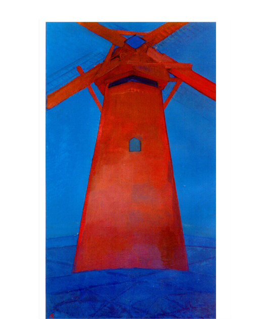
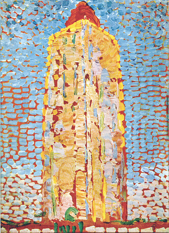
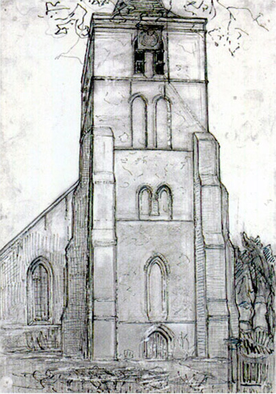
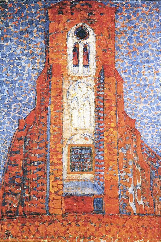
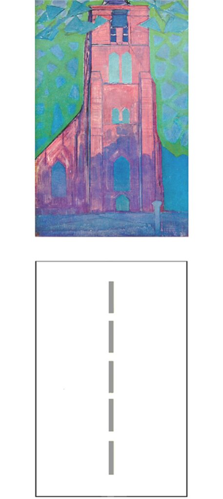
At the same time the painter’s attention turns to constructions such as mills, lighthouses and church towers:
As mentioned, the horizontal landscapes emphasize an infinite unspoiled nature while the vertical buildings suggest the finite dimension in which human beings think, design and build to rise from a primitive condition of nature.
The history of mankind has been a slow and laborious process of emancipation from natural conditions ever since the Stone Age: from huts of mud and straw to houses of glass and concrete; from oxen to tractors; from an average lifespan of thirty-five years to one of seventy-five. In striving to improve their living conditions, human beings alter the landscape with architecture and transform nature into artifice (the countless objects and tools used for human life today). How are we to define artifice? Is it a natural product or only a human product?
And if mankind is part of nature, are the plastic, concrete, and aluminum used to alter the landscape and move more quickly between the continents the result of natural evolution? It seems as if nature creates a “non-nature” through mankind. A curious contradiction. Nature and “non-nature” or, as Mondrian used to say, natural and spiritual, find in the two-dimensional space of painting a plastic rendering with a contrast between horizontal and vertical.
Moreover, human beings interiority is marked by a search for balance between contradictory drives. Mankind is part of nature but distinct from it at the same time. There is often conflict between natural instincts and what we call intellect, reason or mind, and hence opposition between a part of us that is closer to the natural world and another that often contrasts with it.
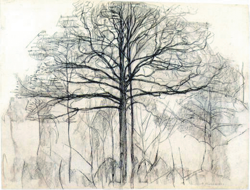
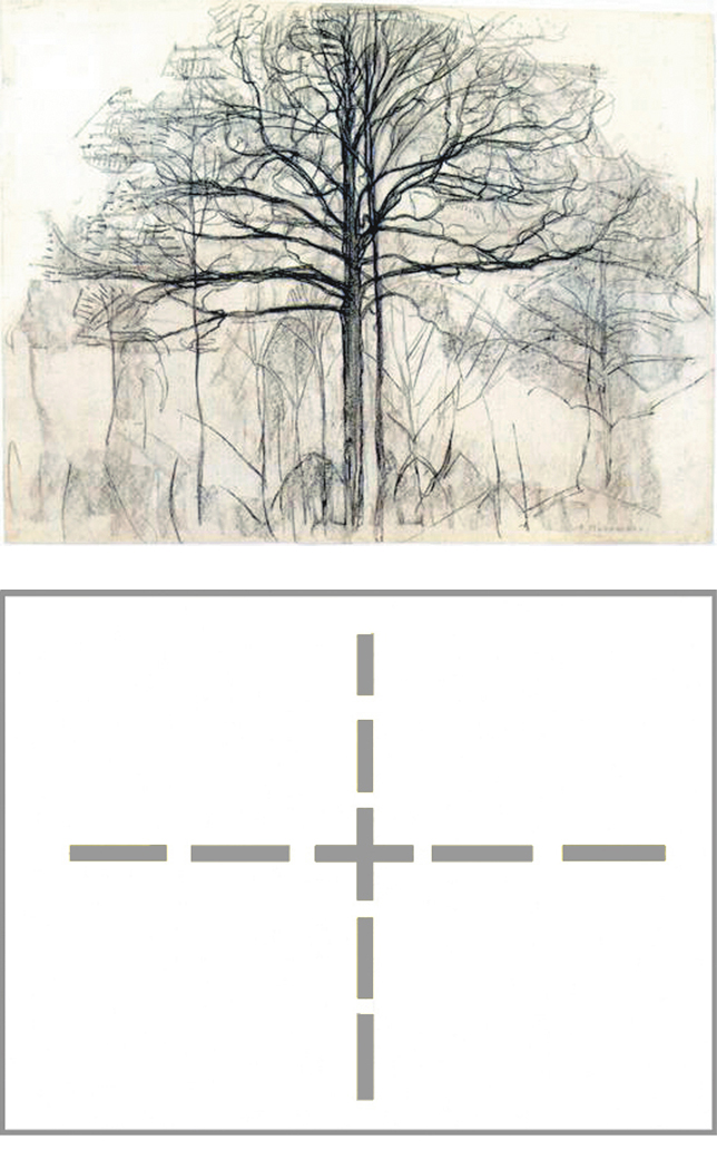
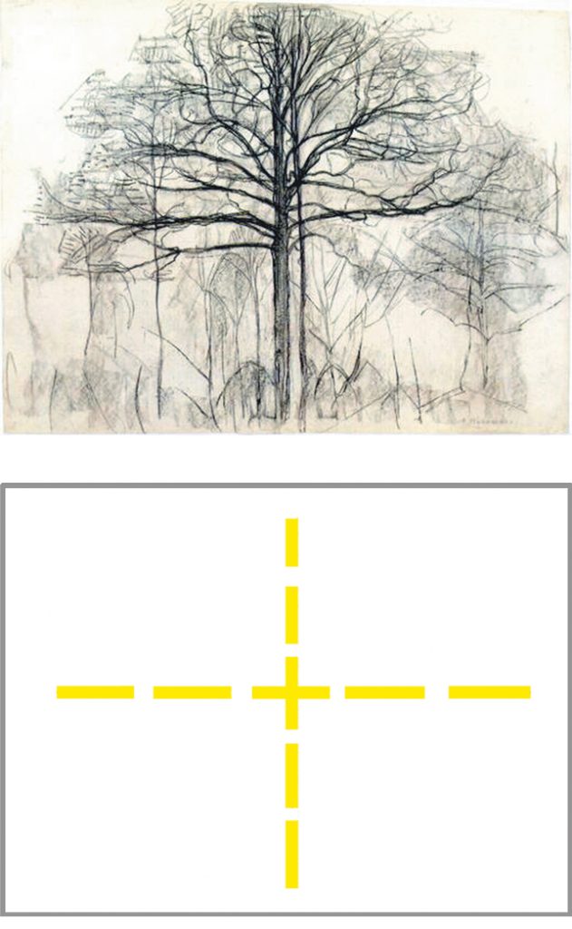
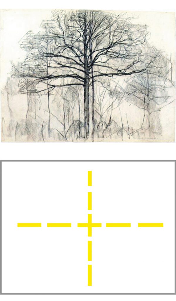
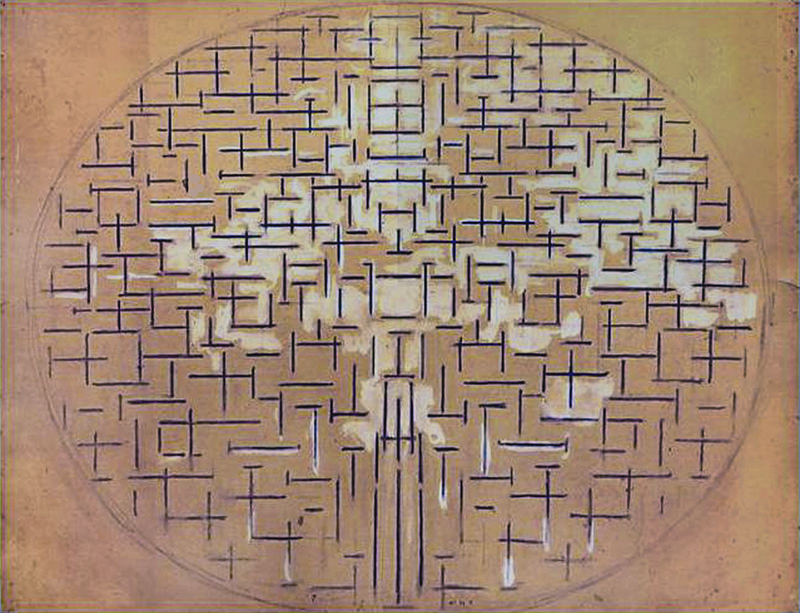
Another subject to which the painter repeatedly returns in this period is the figure of a bare tree. While an horizontal expansion prevails in the natural landscapes and a vertical concentration in the architectural volumes, the opposite directions interpenetrate in the figure of the tree:
1911 with Diagram
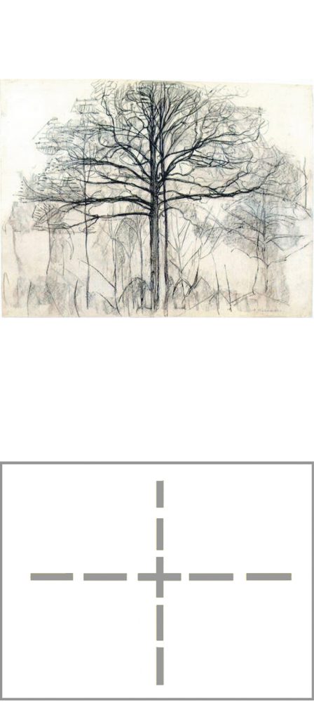
The painter appears to focus in this phase on expressing contrast, both with the alternation of opposing thrusts and through the use of strong colors. Yellow is opposed to blu; magenta to green, red to blu.
In the figure of a bare tree the branches extend horizontally toward the sides while the trunk holds them back toward the center:
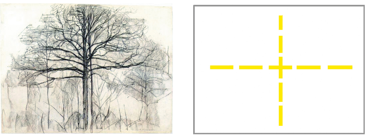
The horizontal expansion of the branches suggests the continuity of the natural space while the vertical concentration emphasizes a central axis corresponding to the position from which the scene is observed. The horizontal expansion of the branches generates multiplicity that the trunk brings back to unity. The figure of the tree therefore seems to me as a metaphor of a relationship between object (the Natural) and subject (the Spiritual).
The visible and the invisible
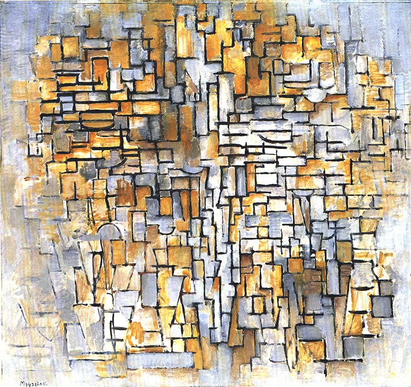
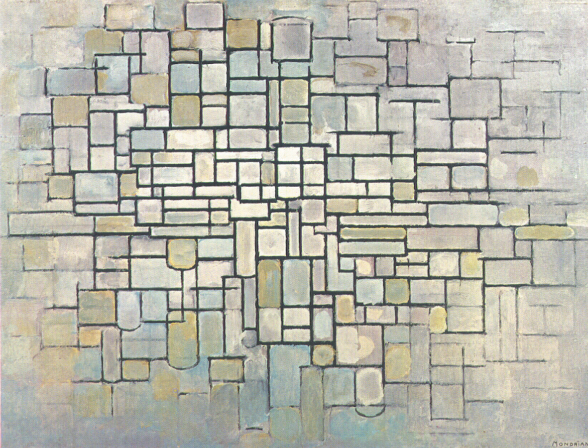
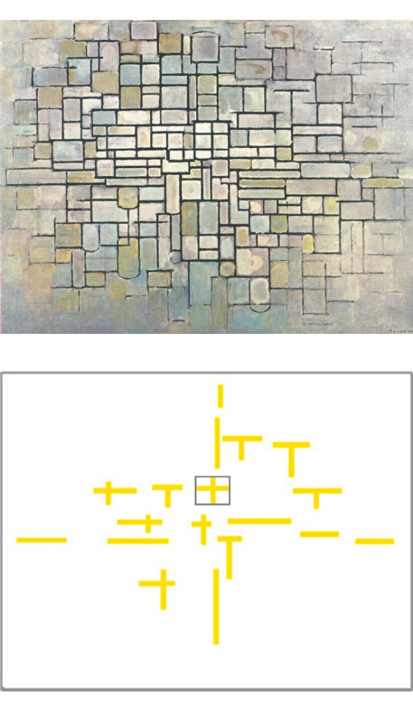
Around 1912 space evolves in a cubist mode:
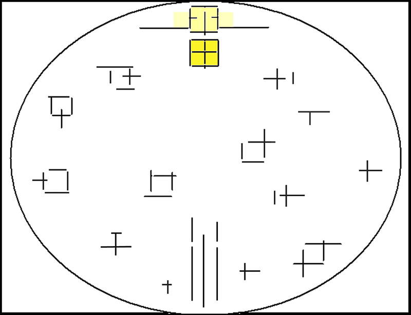
The basic structure of the tree (Fig. 14) reappears within a rectangle at the center of an abstract composition (Fig. 16):
The relationship between horizontal and vertical, which is expressed in a rather univocal and static way (Fig. 14), multiplies and takes on ever changing combinations (Fig. 16).
The basic structure of the tree (Fig. 14) is now expressed in a clear form inside a rectangle placed in the center (Fig. 16) while all around we see that basic structure continually changing in appearance. It looks as if the artist wants to evoke a variety of possible “trees” or, at the same time, suggest the idea of the same tree observed from changing viewpoints.
A dynamic perception of the observed scene had been initiated by Cézanne and then applied by Braque, Picasso and other Cubist painters.
Fig. 16: The rectangle in the center recalls something more stable and enduring (the unity invoked by the Spiritual) in a sea of ever changing situations (the multiplicity of the Natural):
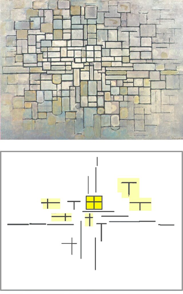
Composition II, 1913,
Oil on Canvas, cm. 88 x 115
with Diagram
Unity becomes dynamic
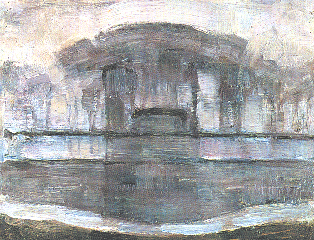
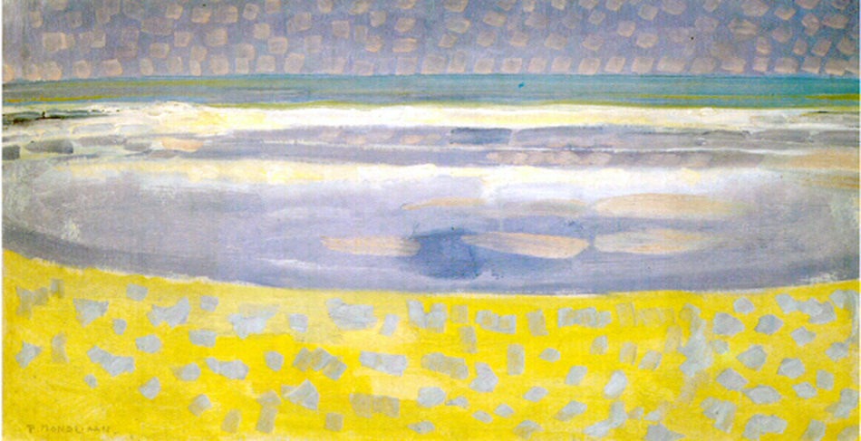
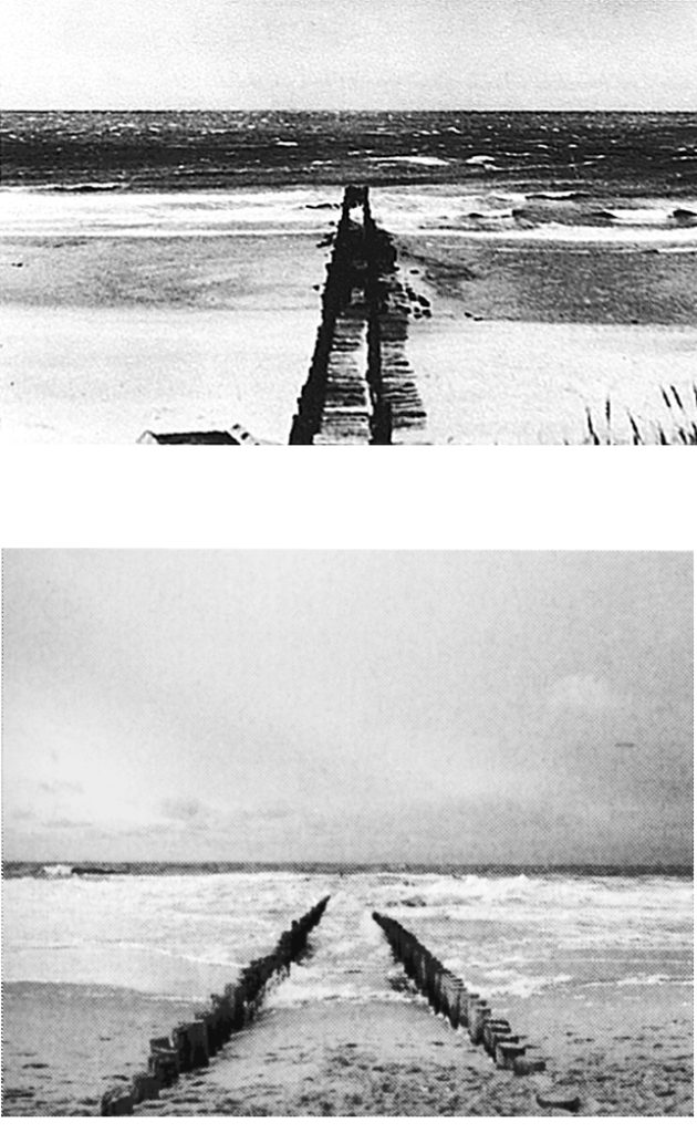
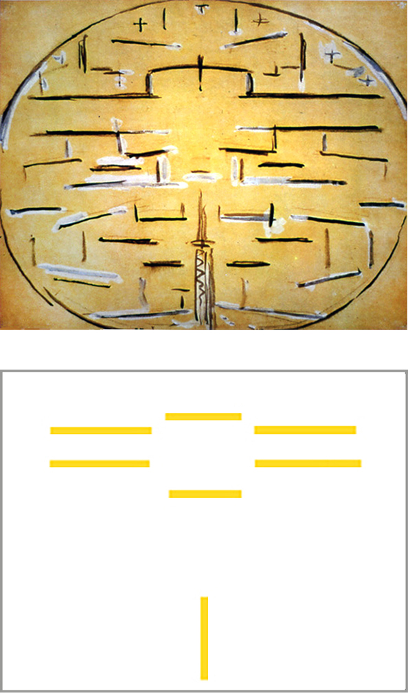
What has been seen so far is confirmed and evolves further with new works that take as their motif a pier extending into the sea (Fig. 17 and 18):
The artist probably saw the pier structure as a symbol of permanence, interpenetrating with the changing flow of the sea.
From the painter’s point of view the pier appears as a vertical progression toward a finite point in the center while the sea extends horizontally unlimitedly. This interaction between opposites recalls the horizontal extension of the previous land and seascapes and the vertical development of the mills interpenetrating in the basic structure of a tree.
The pier develops from the bottom-center of the composition (like the tree trunk) while the sea flow expands horizontally (like the tree branches). Same as the trunk with respect to the branches, the vertical pier tries to hold and concentrate the horizontal expansion of the sea:
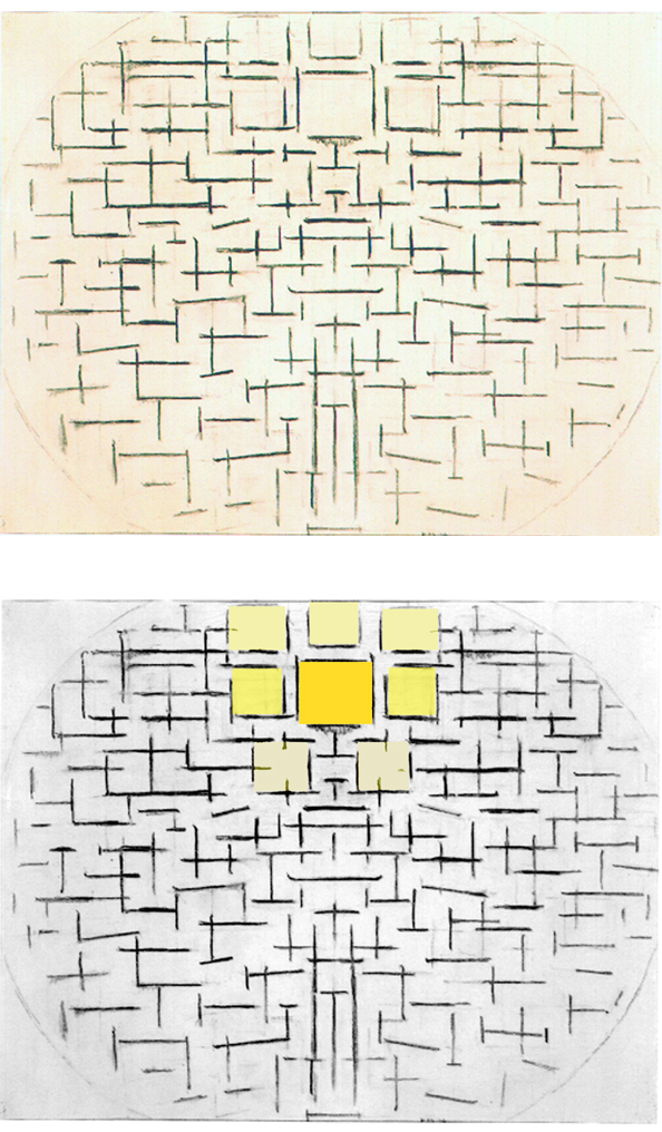
Fig. 18: The concentrating action of the vertical generates in the upper central zone of the composition a sort of rectangular field which then blossoms into a set of approximate square proportions with one larger and more defined square in the upper central area of Fig. 19:
The square form evokes the moment when the plastic symbols of the Natural (horizontal) and the plastic symbol of the Spiritual (vertical) acquire the same measure, that is, an equal value. The mutability of nature as well as the uncertain paths of human existence, on the one hand, and the desire for stability and certainty that pervades human beings, on the other, achieve balance and unity in the two-dimensional space of painting through a square proportion in which opposites are reconciled, expressing a balanced synthesis.
All the surrounding signs where one aspect prevails over the other, generating on-going mutable imbalances, find for a moment in the central square an ideal unity.
An invisible overall design
By reducing the ever-changing appearance of the world to a multitude of orthogonal signs, Mondrian performs an arbitrary operation with respect to our common perception of reality. However, this allows him to express on the contained space of the pictorial surface the widest diversity (every sign is different) while maintaining something constant (the perpendicular relationship). The process of abstraction allows the artist to evoke the immense variety of the outer world without sacrificing the need of synthesis and unity that arises from within.
Each sign is different from the other but they all share the same intimate essence (the orthogonal relationship), just as every single being in nature is different from the other but they all share same basic elements that reveal an invisible overall design.
“There is a common design to all things, plants, trees, animals, humans and it is with this design that we should be in consonance.” (Henri Matisse)
The task of faithfully representing the fleeting appearance of each individual thing has since been taken over by photography.
Evolution of the square unit
In Fig. 19 we can see a variety of smaller, undefined squares around the large, central one:
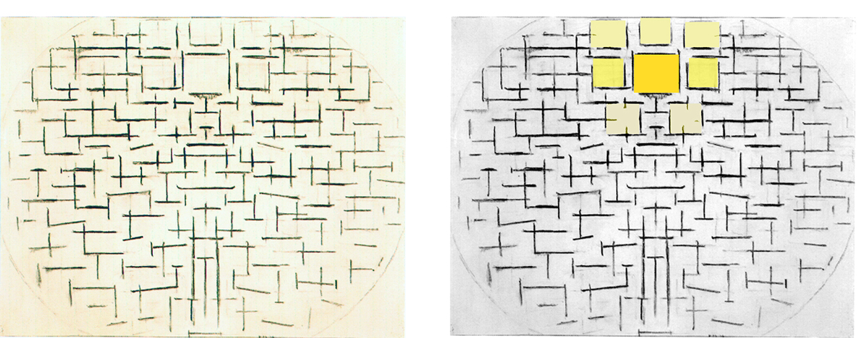
Pier and Ocean 4, 1914 with Diagram
We see a progression from a sporadic and disordered alternation of horizontal, vertical, and vaguely oblique strokes in the lower part of the composition towards the upper part where we perceive more balanced relationships between the opposite directions which hint at squared areas that finally reach full completion in a large central square.
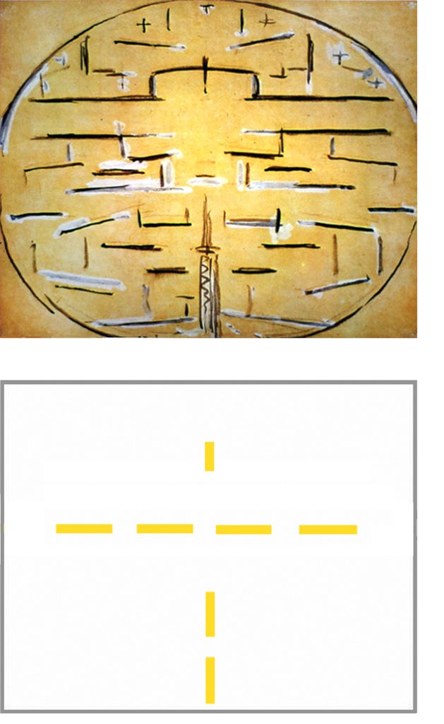
A similar relationship between a fully accomplished square and some undefined squares can be seen in a following version of the Pier and Ocean theme (Fig. 20):
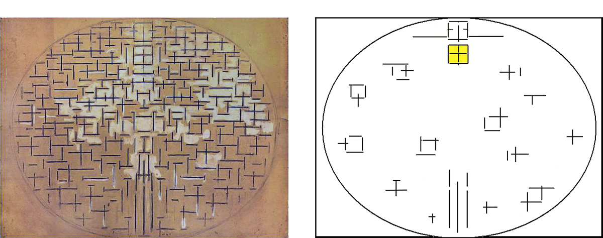
Pier and Ocean 5, 1915 with Diagram
If the central square expresses a fully achieved situation of balance and synthesis between opposites, the incomplete squares suggest situations in which such balance remains unachieved. I am thinking of our constant attempts to reach balance and unity of being between the drives of the heart and the reasons of the intellect; attempts that often remain unachieved.
The squares which remain incomplete evoke a sense of precariousness (the never fully attained balance we strive for during our lives) while the central square suggests an ideal unity invoked by the spiritual within us.
A second square can be seen in Pier and Ocean 5 above the square that suggests an ideal unity:
Within the second square we see a vertical segment separated by two small horizontal lines that protrude from the perimeter of the square to the right and to the left. The two small horizontal segments form two crosses with the two vertical sides of the square. These two signs tell us that unity is opening up to duality.
The unitary synthesis achieved in the lower square in the form of a balnced relationship between opposites is again broken up into a duality that then flows back toward the variety of different situations marked again by the alternating predominance of one direction or the other. The unity generated with the first square opens up again to manifold space with the second.
The unitary synthesis is for Mondrian a plastic symbol of the manifold and controversial space of reality, which attains measure and a harmonious condition in the space of consciousness before opening up again to nature and life.
The unity invoked by the spiritual is of a dynamic nature.
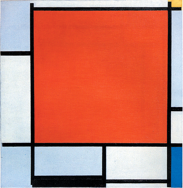
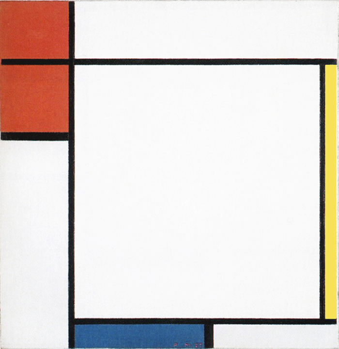
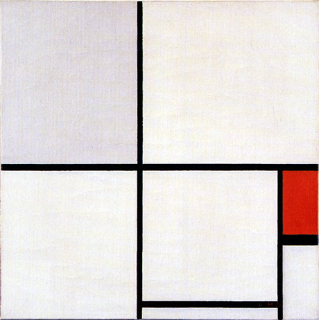
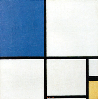
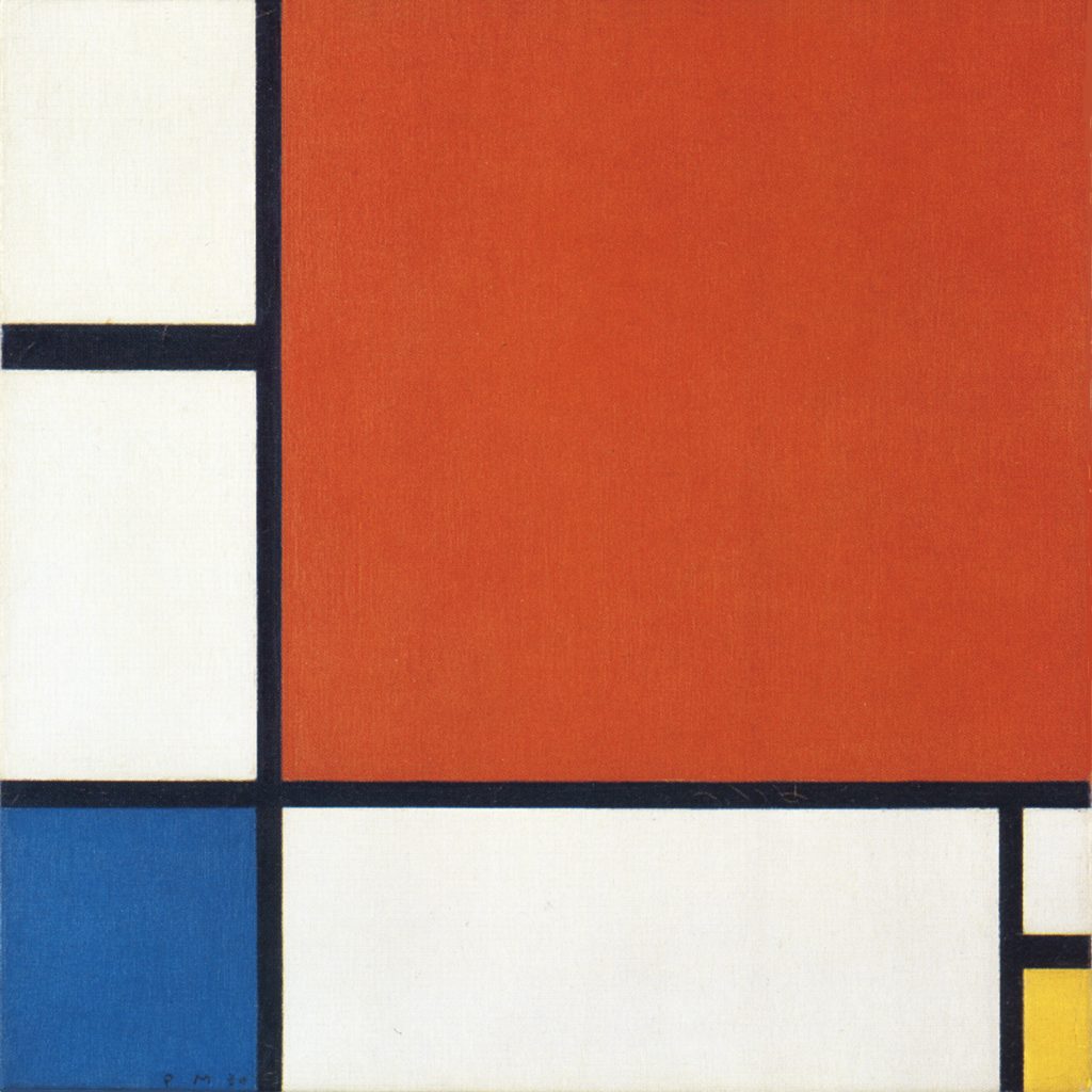
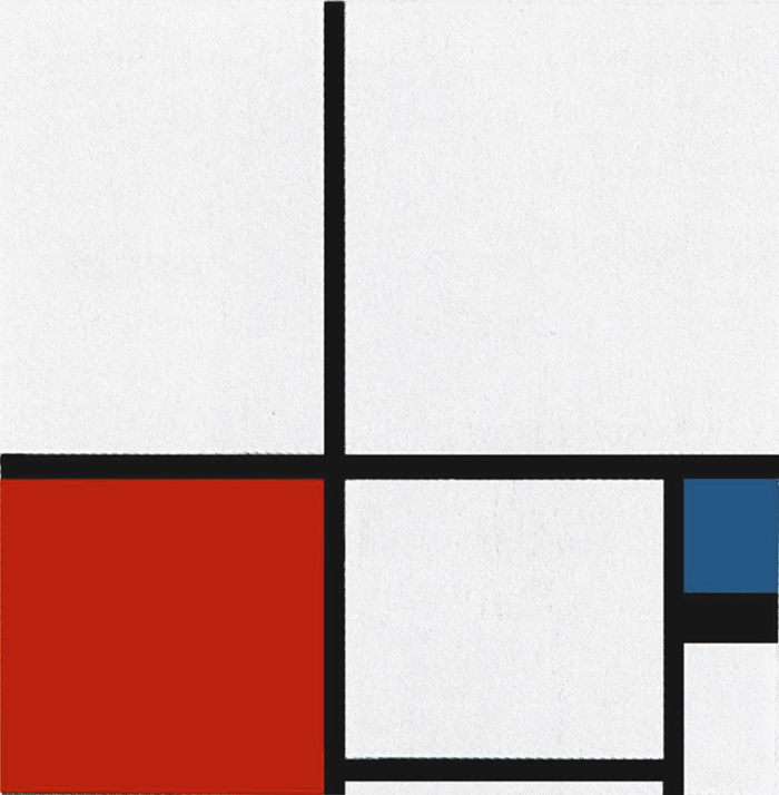
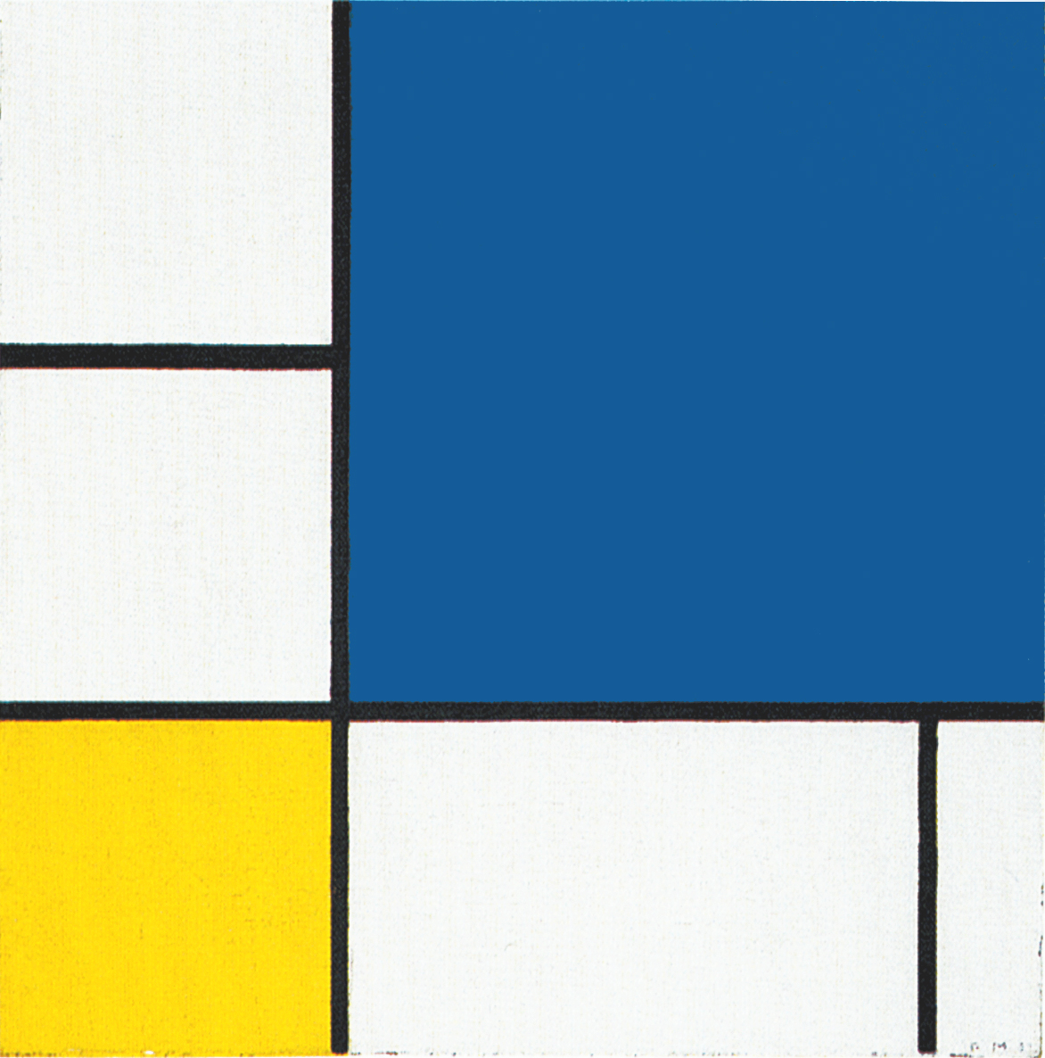
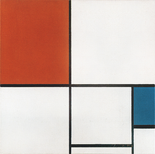
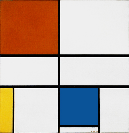
The square proportion that took shape during the cubist phase (Fig. 20) will inform almost all the works Mondrian will paint in the course of the 1920’s and the 1930’s (Fig. 21, 22, 23):
The square will be a recurrent element but one that is in constant flux and unstable balance between opposing directions, mutable size, proportions and colors. The intrinsic symmetry of the square proportion is stressed by a variety of different elements that generate asymmetry just as the unpredictable flow of existence often challenges our certainties.
Not a closed geometric shape
Mondrian does not see the square proportion as a pre-established, closed geometric shape but rather the given moment in which the relationship between horizontal and vertical reaches a balance which is then lost when the opposite directions again start to challenge and attain predominance over one another. The balance of the composition is influenced by all the elements and not only by the square form.
Just as Mondrian chose out of all the possible relations of form the fundamental one expressing the utmost contrast (horizontal-vertical), in terms of color he preferred the fundamental primary colors. Yellow, red, and blue seemed to him the freshest and the best able to transform the painted surface into a living and exuberant reality:
Throughout the 1920’s and during the early 1930s the compositions show a variety of square and non-square areas, now white and fully enclosed on four sides (Fig. 22, 24, 28), now blue, red or yellow opened on one on two sides (Fig. 25, 26, 27):
The square form keeps space constant while differences in its proportion and color change it. We are constantly stimulated by the unforeseeable flow of existence in everyday life and open up to unexpected innovation (evoked here by different forms of variable size, proportions and colors) on the one hand while seeking to maintain the integrity of our established equilibriums on the other (the square proportions).
Every Neoplastic composition expresses this dialectic between the changing aspects of life and the human need to stabilize them and find something of greater constancy and duration which is, however, always subject to change.
“In art, it is important to distinguish two kinds of balance: 1) static balance 2) dynamic balance. It is always natural for human beings to seek static balance. This balance is obviously necessary for existence in time. But vitality, in the continuous succession in time, always destroys this balance. Abstract art is a concrete expression of such vitality.” (Piet Mondrian)
The waves of a sea
Between 1920 and 1942 the square form is a constant feature but in a state of continuous evolution:
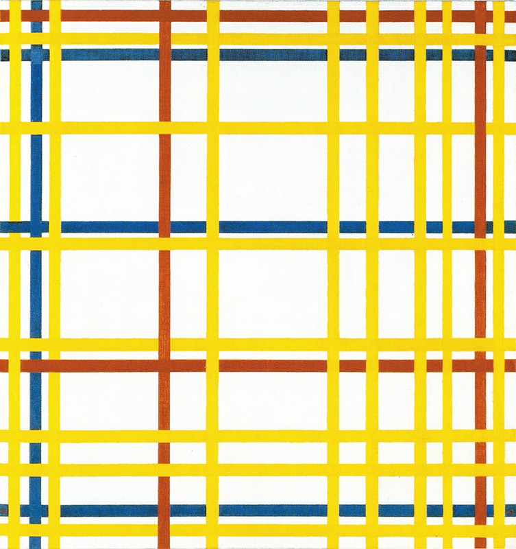
New York City, 1942
Oil on Canvas, cm. 114,2 x 119,3
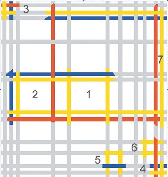
Diagram
In Fig. 30 we see a variety of different squares constantly changing in size, proportions, position and color combinations (Fig. 30 Diagram). The form which is meant to evoke stability and permanence has merged together with the dynamic nature of the lines; the Spiritual has merged together with the Natural.
To use Mondrian’s words: This balance (the balanced relationship between opposites expressed by the square proportion) is obviously necessary for existence in time. But vitality (the dynamic lines), in the continuous succession in time, always destroys this balance (all the predominantly horizontal or vertical rectangles around the squares in which the balance is lost).
At this stage we see a total interpenetration between the quest for stability (when the lines form square proportions) and the inevitable mutability that life brings with it (when the rectangles suddenly generate shifting imbalance between horizontals and verticals).
Even the square is always changing in appearance (suggesting the mutability of nature and human existence) but always more or less traceable as a square (the spiritual quest for balance and unity), just as the waves of a sea are always new and different from one another but still made of the same water. A certain kind of obsolete painting would still look at the apparent shape of each individual wave while abstract painting focuses on the becoming of water.
Nature and life still remain the primary source of inspiration for abstract art. The beauty of a flower is certainly a model to be examined and from which to learn. I am thinking of certain watercolors by Paul Klee as well as the enchanting fragrance of the natural colors, and the incredible wealth of forms that the world offers to our gaze. The ten thousand different lines that we see around us prove on closer examination to be a single interminable line, because in nature everything is manifold and one at the same time.
At this regard we shall make a concrete example:
A tree looks like a small patch of green when seen from far distance but then grows larger and reveals an increasing number of parts as we draw closer before finally displaying an enormous degree of complexity when we observe the complex structure of every single leaf. The initial green spot has become a multifarious reality. If the process is reversed, the tree loses its complexity and reverts to a simple patch of green. Depending on the positional relationship established in each case with the object observed, unity reveals multiplicity which then reverts to unity.
What is the true reality of a tree?
In a world that changes so quickly today in accordance with the changing positional relationship we establish with things, does it still make sense to paint a tree from a single viewpoint, that is, in a figurative way and claim that this is reality?
How could the art of painting represent the outer and inner reality of things observed from different viewpoints except in abstract terms?
For a detailed examination of the evolution process from figuration to abstraction and for an explanation of its existential meanings please visit: An Overview
Copyright 1989 – 2025 Michael (Michele) Sciam All Rights Reserved More
