Please note: If on devices you click on links to images and/or text that do not open if they should, just slightly scroll the screen to re-enable the function. Strange behavior of WordPress.
Black lines open up to colors
This page examines some works that the artist has created in New York City. These will lead to the canvas titled New York City, a work preamble of the last two paintings Broadway Boogie Woogie and Victory Boogie Woogie.
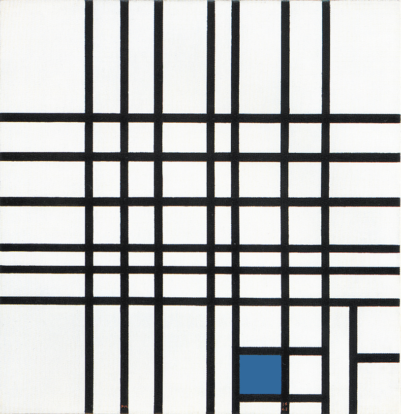
After Fig. 1 where Mondrian has introduced red lines that were initially painted black, new works show the use of white, yellow, red, blue and black lines (Fig. 2, 3, 4):
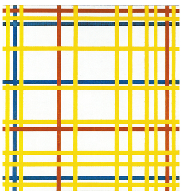
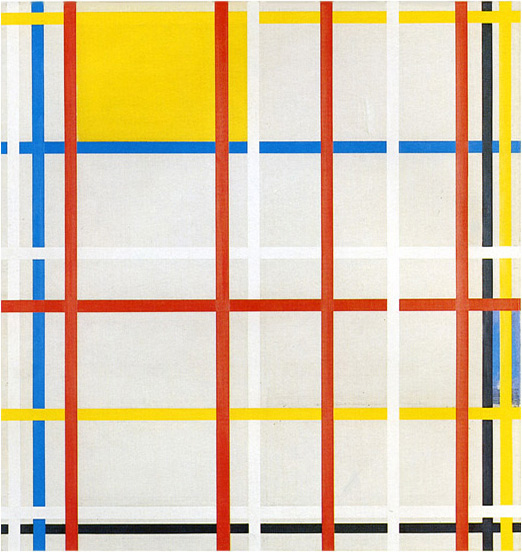
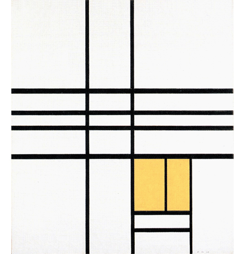
New York Boogie Woogie, 1941-42
New York City 3
1941 (Unfinished)
New York City 1
1941 (Unfinished)

New York City
1942
In 1933 the artist had used yellow lines. The blossoming of colored lines constitutes now a further development in the process of opening up the compositions to multiplicity which had begun in 1934 in terms of form with a progressive increase of black lines:
A new tool
In addition to brushes and oil paints, New York City offered Mondrian a new tool to use in producing his works, namely colored tape, which allowed him to change the positions of the lines and thus work on the composition with greater flexibility. Once a satisfactory configuration had been obtained, it could be made permanent in oils.
Some critics have suggested a connection between the use of color for the lines and the availability of colored tape. I do not believe that this tapes suddenly triggered a change that the foregoing analysis clearly shows.
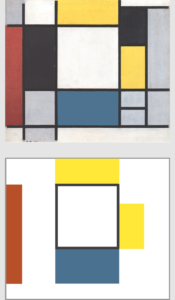
New York City 3
Details supplied by Joop M. Joosten suggest that the painting could be a reworking of a canvas begun in 1938. Mondrian used tape during his work on this composition but never got round to the definitive application of paint:
New York City 3, 1941 (Unfinished)
Pencil, Charcoal, Oil on Canvas, cm 110,5 x 116,8
From what can be seen of this canvas today, he used yellow, red, and blue lines at the same time accompanied by two black lines and, unusually enough, also five white lines. The latter appear such in virtue of the fact that the canvas, if I remember rightly, was never primed and is therefore ivory in color.
The combination of lines of different colors produces forms that change constantly in appearance:
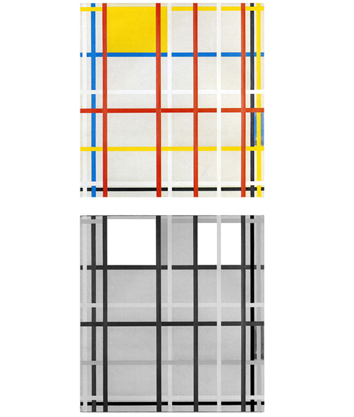
Diagram A
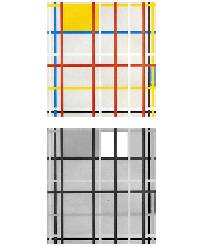
Diagram B
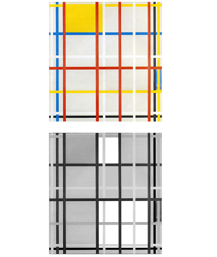
Diagram C1
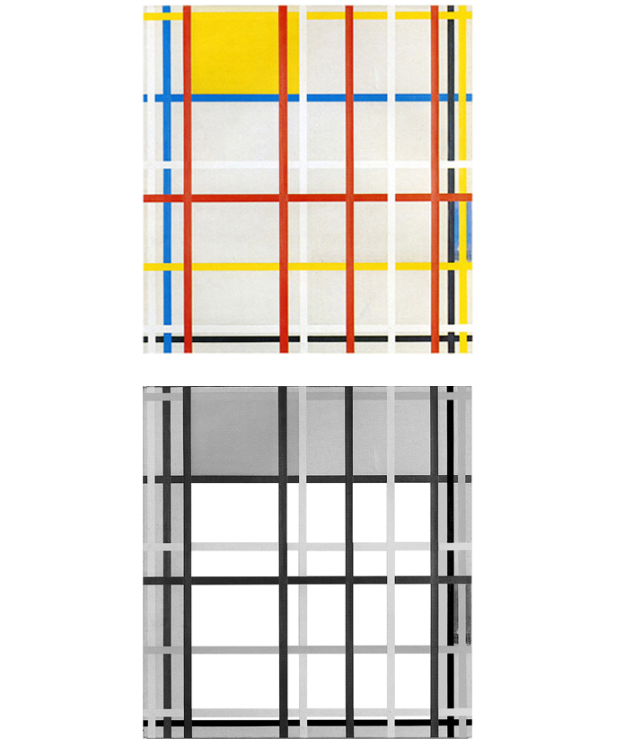
Diagram D
The different visual weights of the colors used for the lines emphasize certain forms with respect to others. The areas marked out with white lines are less conspicuous than those with red. A yellow plane can be seen in the upper left section and a blue one of uncertain nature on the right edge of the canvas. The yellow plane extends horizontally but is led by a red vertical line on the right toward a square formed by another red line on the left and a blue line below (Diagram A):
New York City 3, 1941 (Unfinished)
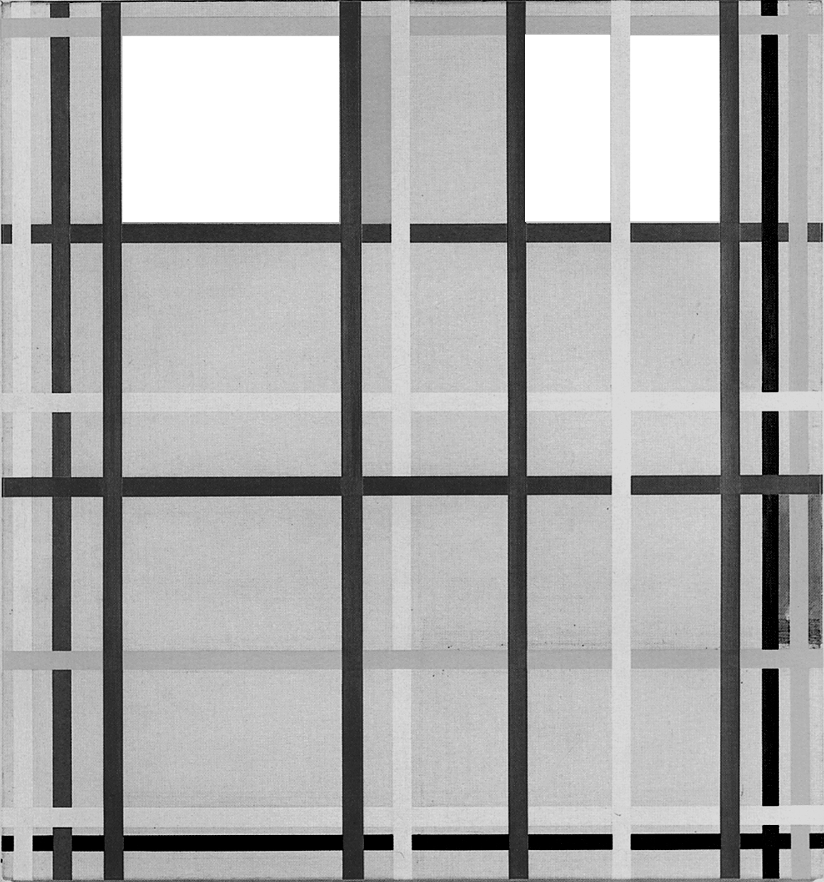
Diagram A
In this plane, which is in a state of dynamic equilibrium between the horizontal expansion of the yellow and the concentrating force of the red line, the opposing directions attain equivalence for an instant in a square of yellow, red, and blue.
Right of this square another square area can be seen formed by a yellow line at the top, a blue line below and two red vertical lines. We therefore have another equivalence of yellow, red, and blue. With respect to the first square, however, the inner field of the square is no longer yellow, being crossed by a white vertical line. The latter works with a second white line on the left to generate a third square form (Diagram B):
New York City 3
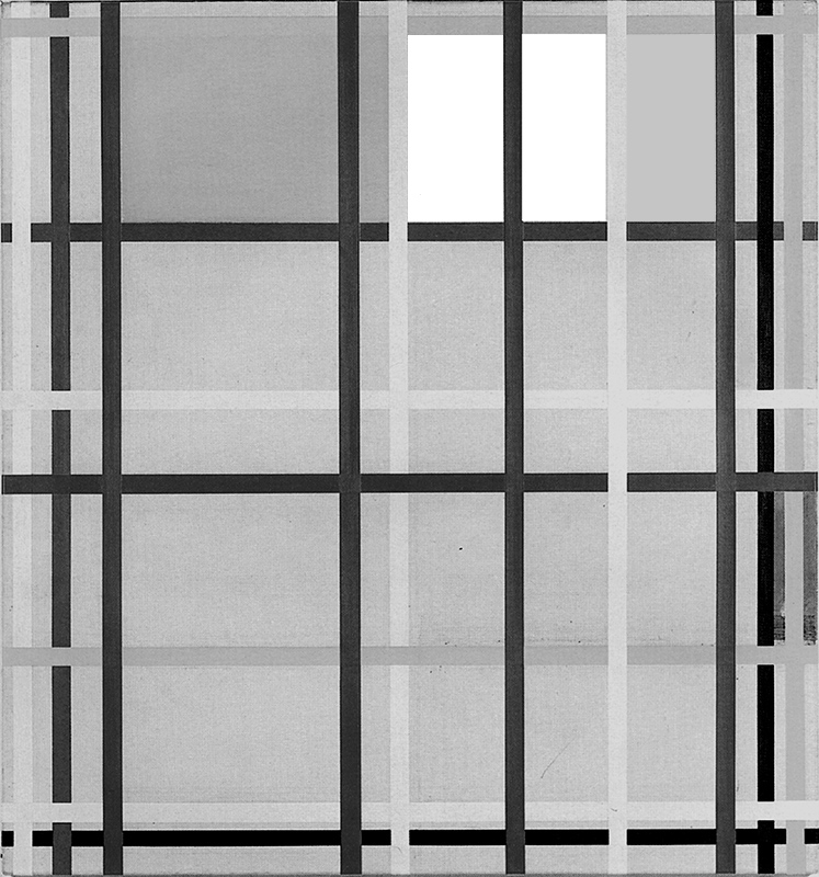
Diagram B
As noted above, due to the visual weights of the colors, the square on the right side of the diagram A stands out more than the square highlighted in diagram B. The silent white line that subtly disturbs the equilibrium of the square seen in diagram A is strengthened (becomes red) inside the square shown in diagram B. Observe the two squares in sequential order. The red line dividing square of diagram B seems designed to tell us that the equivalence of the opposites – the unitary synthesis of vertical and horizontal, yellow, red, and blue – is dissolving which is what happens in diagram C:
New York City 3
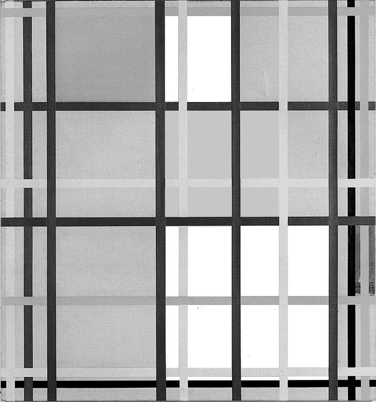
Diagram C
An area of horizontal predominance (the yellow plane) is transformed into an equivalence (Diagram A) that then dissolves gradually (Diagrams A, B, C):
Diagram A
Diagram B
Diagram C
We note once again that different parts of a Neoplastic composition prove to be a single entity represented in its process of becoming. The content of a Neoplastic painting stretches far beyond the limiting and partial descriptions that verbal language can supply. The reading of a composition must be reiterated in order to capture all of its substance. Through bright and exuberant colors, above all on beholding the original paintings, the eye addresses a dynamic set of relations. The eye reads and rereads the same pathways, which evoke new relations every time and thus express a rich and varied “landscape”.
The composition presents other square forms such as the one shown in diagram D or the square area seen in diagram E:

Diagram D
New York City 3
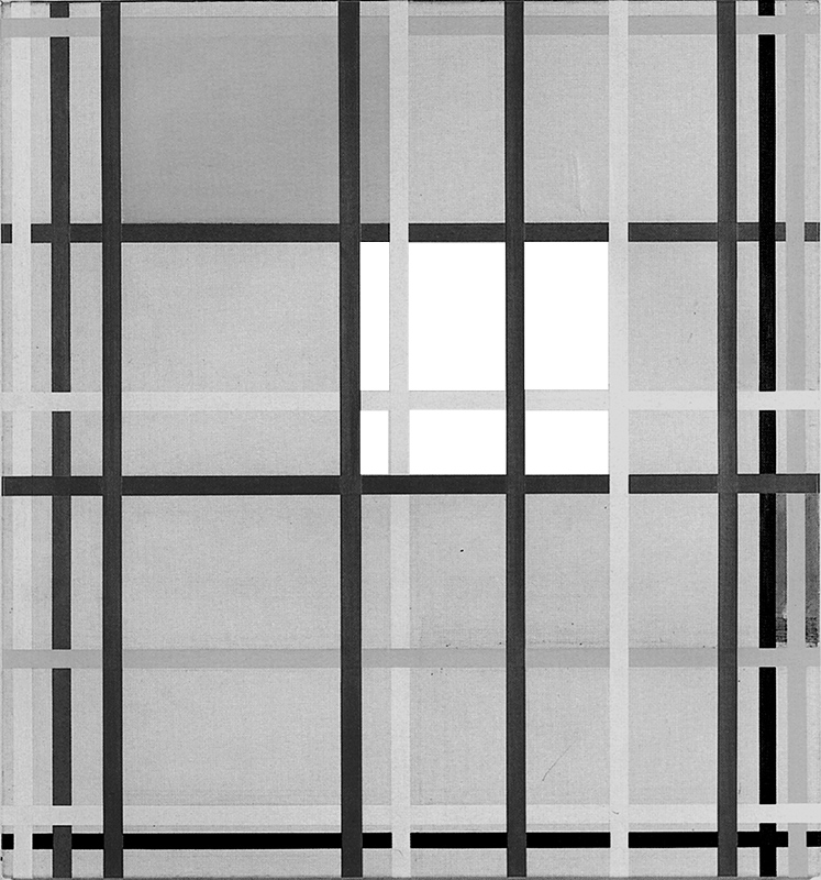
Diagram E
The inner field of the large square area is crossed by lines of different color that generate a variety of more or less obvious rectangles.
Traveling along the lines, we then find a new form balanced between a slight vertical predominance which then becomes a horizontal rectangle. Uncertain square forms scarcely have time to manifest themselves before being pulled away by the rapid continuity of the lines.
The dynamic flow of the lines causes pressure and crisis for the equilibriums manifested for an instant through the equivalence of the opposite directions and the different colors. While the eye pauses on a single form, the space begins to move anew with an alternation of expansion and concentration. The planes are barely visible when formed by white lines. The greater or lesser permanence of the square forms now depends also on the color of the lines forming them.
The blue plane on the right is so markedly vertical as to look almost like a segment of line. This plane appears designed to compensate for the absence of blue lines in that area of the composition and, at the same time, to endow the whole with a certain weight and counterbalance the horizontal yellow plane:
New York City 3
Diagram C1
With respect to the square seen in the lower section of diagram C1, the blue plane is in the same position as the small accents of color in the canvases based on Layout C.
New York City 1
Curator Frau Meyer-Büser from Kunstsammlung NRW, Germany has suggested that, according to a photograph taken in Mondrian’s studio a few months after the artist’s death, the painting could have been hanged upside-down ever since as shown here in Fig. 3 – Old position:
New York City 1, 1941, (Unfinished),
Oil, Paper, cm. 115 x 119
New York City 1, 1941, (Unfinished),
Oil, Paper, cm. 115 x 119
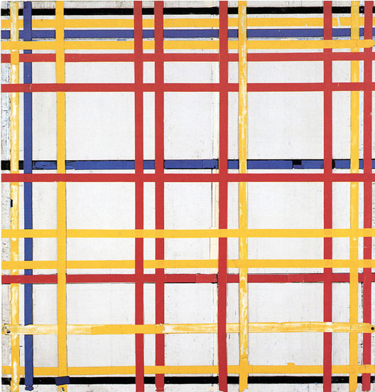
We cannot be sure of this because it is an unfinished work without signature but I personally think that the assumption could be true. I am therefore considering this work in the new position (Fig. 3 New position). Even so, there are no significant changes in the way the composition shall be interpreted. What actually would change in the new position is the fact that, due to the increased amount of lines and therefore of visual weight in the higher part of the canvas, the whole composition acquires tension.
Like Fig. 2 Fig. 3 presents a multiplication of space with fourteen horizontal and ten vertical lines generating a complex set of varying relations. There are no longer any colored planes appearing in this composition.
We contemplate a multiplicity of relationships between opposite lines where now one and now the other direction prevails, then find square proportions, i.e., situations where opposites reach the equivalence. Diagrams A, B, C:
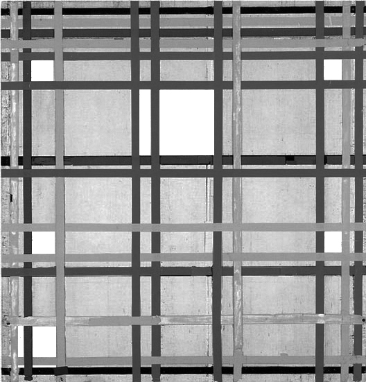
Diagram A
New York City 1
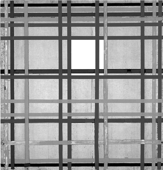
Diagram B
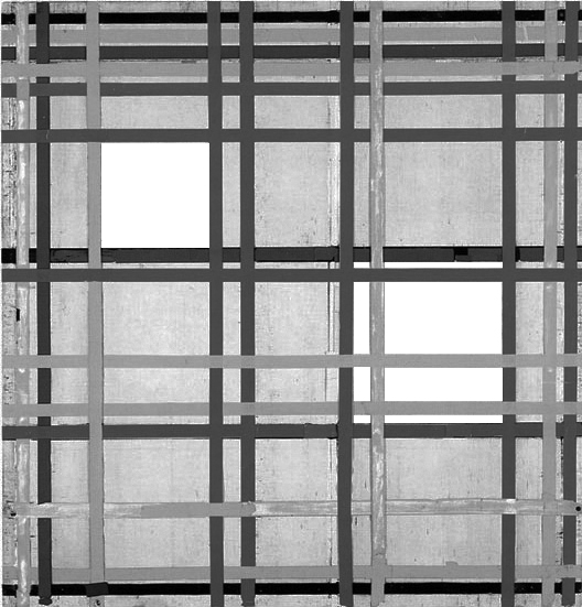
Diagram C
The square proportions are then always challenged by sudden horizontal or vertical expansion, the presence of one color or another.
As in Fig. 2, the squares appear to be formed by more than four lines. They thus expand and contract, alluding to the loss and subsequent re-establishment of an equivalence of opposites. The squares are now less sharply defined and even more precarious than those formed by single lines.
New York City 1, 1941
(Unfinished)
A greater density of elements is concentrated in the higher section, where the horizontal lines are so close to one another as almost to suggest a single area made up simultaneously of the different colors.
Of note is the center-high area of the composition where we see an interplay between three different squares that overlap each other as if to express a square in the making that changes appearance:
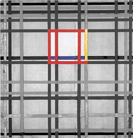
Diagram D
One square consists of four red lines; another of three red lines and one yellow line; a third of two red lines, one yellow line and one blue line. From the first to the third square we see a synthesis of the three primary colors gradually forming. It should be remembered that since 1901 Mondrian often suggested a synthesis in the central area of the composition:
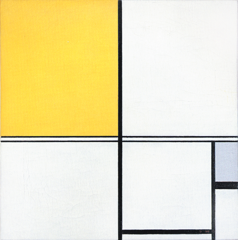
1901 with Diagram
1919 with Diagram
1920 with Diagram
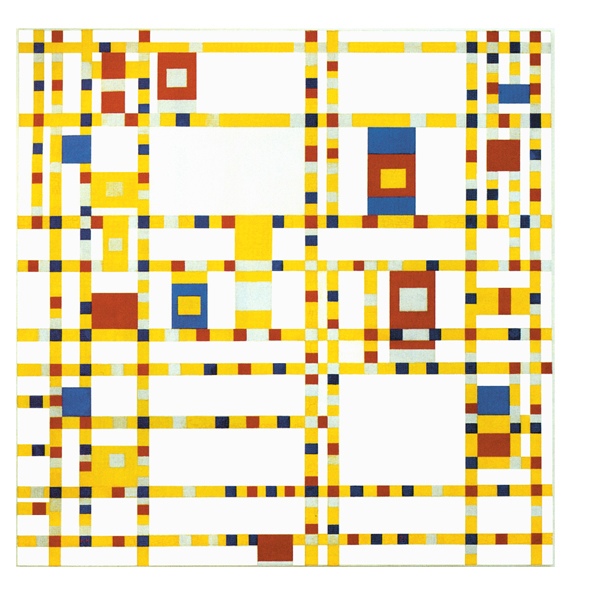
New York City
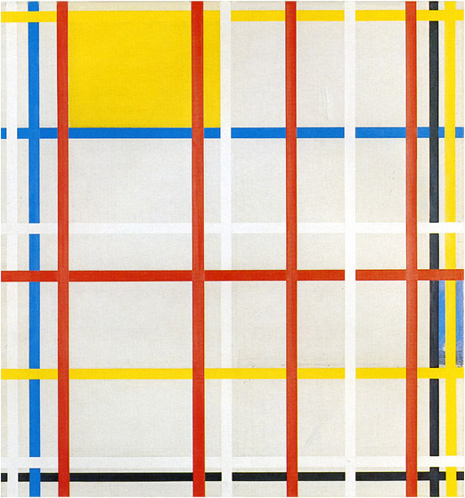
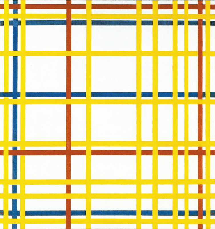
The opening up to color took definite shape in Fig. 4, where the lines are yellow, red, and blue and there is no black at all. The composition apparently presented nothing but yellow lines and a red plane in its initial state but was later reworked by removing the plane and adding red and blue lines. We see here no fewer than twenty-three lines, fifteen of which are yellow, four red, and four blue:
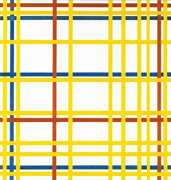
New York City, 1942,
Oil on Canvas, cm. 114,2 x 119,3
The visual weight of the three colors seems to influence their distribution. Blue and red have greater visual weight and are therefore present in smaller quantities than yellow, which is visually the lightest color (the closest to white). A larger quantity of yellow is needed to compensate for the greater visibility of red and blue. The painter seeks to redress the qualitative balance of the colors through quantitative distribution, providing an example of the dynamic and asymmetric conception of equilibrium.
Yellow, red, and blue lines expand and contract the white surface of the canvas, which is maintained in a state of unstable equilibrium between the two opposing directions. There is an alternating predominance of horizontal and vertical together with different combinations of colors in the different areas. Horizontal and vertical sometimes attain equivalence and assume proportions of comparatively greater stability.
Diagram A presents a series of square forms numbered from 1 to 7, some of which interpenetrate. Each square differs from the others also in relation to the position assumed within it by lines of the same color. Squares 1 and 2 are similar in terms of form but differ as regards their respective distribution of colors. The same holds for 3 and 4:
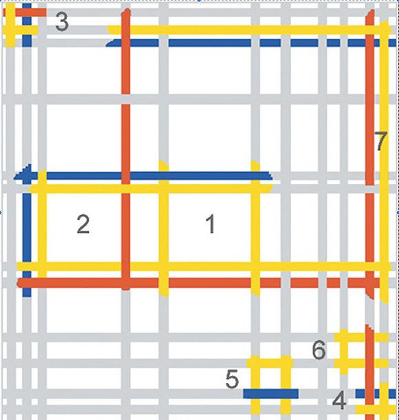
Diagram A
New York City, 1942
Squares 1 and 2 are formed by six or eight lines of different colors and appear to be less sharply defined. Mondrian seems to have been intent above all in square 2 on combining the three colors so as to express a synthesis of yellow, red, and blue. The yellow lines expand the equivalence toward the right, the square becomes a rectangle and the equivalence of opposites is lost. The unitary synthesis marked out with the three primary colors is lost if only one color is taken into consideration.
Other squares are formed of only two colors (5 and 6). In 6 a completely yellow horizontal rectangle attains equivalence with a red line; the same thing happens in 5 with blue.
Shape 1 is a field formed by four yellow lines which present slightly horizontal proportions. The rectangle attains an equivalence of vertical and horizontal if seen in relation to the blue line above or without this but in relation to the red line below. If the yellow rectangle is instead observed in relation to both the blue line and the red, the slightly horizontal initial proportions become slightly vertical. We thus see a dynamic square that oscillates between a slight horizontal predominance (all yellow) and a slight vertical predominance (yellow, red, and blue).
Diagram B shows part of a vertical red line and part of an horizontal blue line which tend to concentrate a yellow rectangle into a square form made of the three primary colors (Shape 8). Each color needs the other one to reach balance and unity seen in the square proportion:
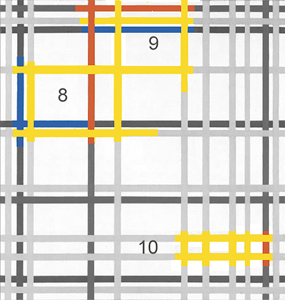
Diagram B
New York City, 1942
With shape 9 we glimpse at a yellow horizontal rectangle which becomes for a moment a square form made of the three primary colors before being pulled away toward the left by an imposing red vertical line. The different visual weight of the colors has an influence on the immediacy with which the relationships are perceived. The eye travels along the lines, stops, singles out a certain configuration, and lingers on it, but all around the space is set in motion again with the alternating predominance of the different colors and directions.
Square forms generate and dissolve in a variety of combinations between yellow, red and blue lines. The permanent black and white square unit of the 1920’s has now become dynamic and multiple; not only in terms of form as we have seen in Composition N. 12 with Blue but also in terms of color.
Diagram B: It strikes me as important that in the lower right section (Shapes 10) it is yellow and yellow alone that expresses rectangles with a predominance of one direction or the other. These three forms are made up of lines of the same color. In this case, the variable relations between the opposite directions are wholly homogeneous in chromatic terms and it is form alone that expresses mutation.
The rectangles that remain entirely yellow are smaller than those that are formed by lines of different colors. They can be seen as small basic units that can only grow if they open up to diversity by mixing with the other colors. Which is what happens with the fourth shape to the right which attains balance (square proportion) by combining with red.
Diagram C shows how a square form is developed inside a vertical field that runs through the center of the canvas from the bottom to the top:
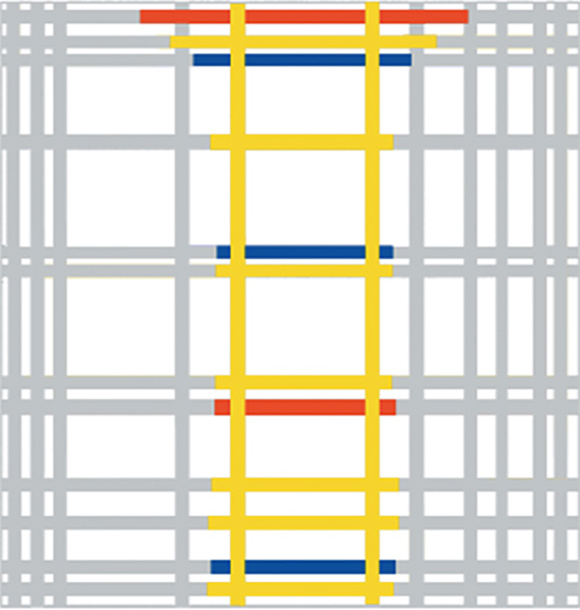
Diagram C
New York City, 1942
Reading up from the bottom, we see a red and a blue line marking out a rectangular field (1) crossed by two horizontal yellow lines that seem to suggest a barely visible square, which takes clearer form in 2:
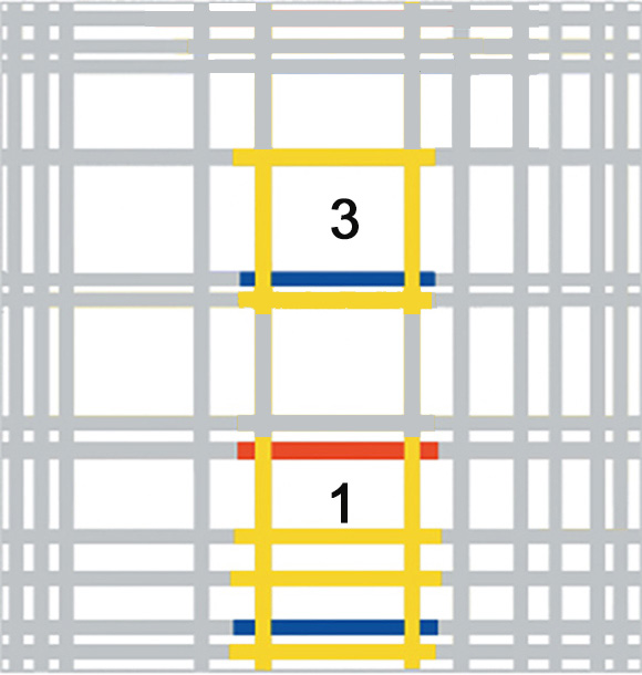
Diagram C – Detail
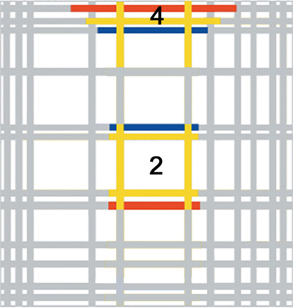
Diagram C – Detail
The slight vertical predominance generated in this square (2) by the simultaneous presence of the blue and the red produces a counter-reaction higher up and the square now expands horizontally once again (3 and 4).
The finite and balanced dimension of a square form (2) flows back into the infinite dimension of the lines, that is to say, either one or the opposite direction only. The equivalence of opposites, i.e., a balanced synthesis between the spiritual and the natural, mind and body and all sort of contradictory drives we experience in our daily life, appears and disappears. The equivalence of opposites is of a dynamic nature.
Mutatis mutandis, what we have just seen recalls the compositional development of Pier and Ocean 5 of 1915:
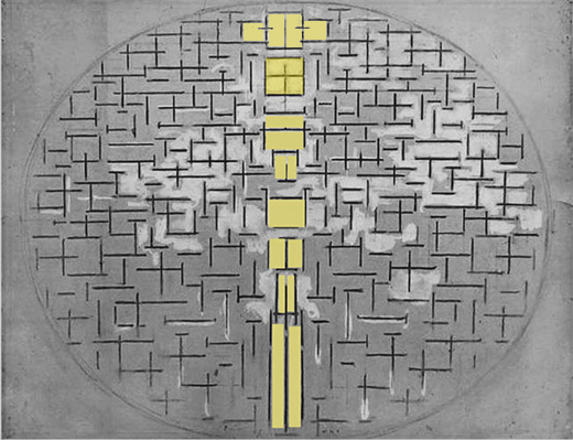
Diagram
Diagram C
Observe the four compositions below as a single sequence. In 1920 the colored planes had the function of decentralizing and make dynamic a space dominated by a single large white square formed by black lines:
The square absorbed color over a span of twenty years and multiplied all over the surface of the canvas in 1942, changing in terms of position, proportions, and relations between the different colors. The single black and white unity of 1920 has undergone interpenetration with manifold space and is now wholly imbued with color and dynamism.
To escape the war, Mondrian had moved from Paris to London in 1938 and by the end of 1940 he arrived in the USA.
The artist lived in New York for three years and four months. This time was divided, more or less equally, between two successive dwellings not far from each other. The first was located at the corner of First Avenue and East 56th Street. The artist had two bedrooms and a kitchen on the fourth floor. The room that served as his studio faced First Avenue, so that the brightly colored rectangles he used to place on the walls could be seen from the street. He often changed their place, like a painting in perpetual evolution.
Mondrian’s second apartment was very similar to the first. It was also on the fourth floor and consisted of a kitchen and two rooms, one of which was used as a studio and the other as a bedroom. The studio is almost empty: a folding easel and two white-painted crates, one of which is used as a palette stand, the other as a color cupboard, that’s all. The walls, also painted white, are strewn with squares of primary colors whose arrangement recalls the compositions with rectangles and without lines of 1917.
The bedroom contains a narrow bed and a frail folding armchair. From the remains of two crates he has made a small wardrobe that sits on the floor. Another crate serves as a seat in front of a small table (just enough to put some papers and an alarm clock). This one is, like all the rest, made of crate debris. This meager equipment has been carefully painted white. The sobriety, the pure lines, give the room a perfect elegance. Here again, the same squares of painted cardboard play on the wall a very sonorous pizzicato of the three primary colors on a uniformly white background.
This is obviously the home of an ascetic who reduces his life to the essential and the essential to the lightest rudiment. But this ascetic is by no means a sorrowful spirit: he loves color and it is through it that the temporal slips into his life. He is an ascetic artist, an ascetic very sensitive to plastic values, the ascetic of beauty in itself. Mondrian is the first contemplator of a transcendent aesthetic, the first picture maker of the absolute.
Michel Seuphor, Piet Mondrian, Sa Vie, son Oeuvre, 1956
Next page: Neoplasticism – Part 6
back to overview
Copyright 1989 – 2024 Michael (Michele) Sciam All Rights Reserved More